What to Include in Your Art Licensing Portfolio (Plus Examples)
The key to a successful surface design and art licensing career is your art licensing portfolio! I often get asked what to include in your art licensing portfolio, so today I want to share some portfolio examples and my process for putting together a strategic portfolio that will help you land art licensing collaborations!
When I say that you need a strategic portfolio, I mean that your artwork needs to be commercially viable. Potential clients want to see artwork that is beautiful and unique, but most importantly, art licensing companies are looking for art that will sell well on products. Your job is to find the overlap between creating art that interests you, and trend-forward illustrations that customers want to buy. This will increase your chances of standing out to potential licensees and getting your art sold on products worldwide.
Here’s what I’ll cover in this post (click to jump to any of these sections!)
Want to see examples of my actual art licensing portfolio? Click here to see the portfolio that my agents are pitching for me right now!
Identifying Your Ideal Audience
A strong art licensing portfolio begins with research! We’re taking a strategic approach, after all! Once you’ve done your research, building your portfolio will be a breeze.
Start by creating a customer avatar. Who is the ideal audience for your art? The more specific you can get about this the better. In my case, my goal is to appeal to stylish millennial women. Knowing my audience helps me determine which brands are a good fit for my artwork, what kinds of products I want to design for, and what subjects to choose.
Once you’ve decided on your ideal audience, choose a few brands that are also targeting that same audience. This is going to help you determine what’s currently trending and popular with your ideal audience. In my case, Anthropologie and ModCloth are some big retailers who align with the same women I’m trying to target. Plus, they’re both in the fashion and home decor niche which is perfect for gathering visual inspiration and trends.
Research What’s Trending
Now that you have a list of retailers, it’s time to start browsing their catalogs! While you’re doing this, look for patterns. I’m not talking about surface design patterns. I’m talking about common themes! You might notice certain color combinations popping up over and over again. Or you might be able to pick out common motifs that keep coming up. These patterns will help you decide what’s currently trending with your ideal audience.
For example, Anthropologie’s summer collection was filled with lemons, tomatoes, and mediterranean vibes.
So I used this as a sign to include lemon and citrus artwork in my portfolio!
This is just one of many trend tracking tactics I teach in my class, Trend Forecasting for Creatives. If you want to learn how to discover profitable trends before anyone else, you’ll want to dive into this class to learn all of the tactics I use to predict trends!
Creating New Artwork + My Formula for Strategic Illustrations
Now that you’ve done some trend research, it’s time to start creating new artwork! I use a simple, three-part formula to help me decide what kinds of illustrations to add to my art licensing portfolio:
Theme
Motif
Color
Choosing a Theme
Start by identifying some high-level themes from your trend research. Are you seeing lots of animal motifs on products? Or maybe food like the example above? Starting with the high-level theme will help you narrow down what to draw, plus it’s great for helping you shape full collections as well!
Choosing a Motif
Once you have your theme, choose a motif or motifs for your illustrations. For example, if animals are your main theme, narrow it down to see which kinds of animals are popular. I have a lot of jungle cat illustrations in my portfolio since they tend to be popular sellers. I also usually pair them with some kind of tropical foliage which is another trendy motif.
Choosing a Color Palette
Lastly, you’ll want to choose a trend-forward color palette for your illustration. I usually choose one color palette to start with and then recolor my artwork once it’s finished. Having multiple colorways of your illustration will help you appeal to a wider audience.
If you use trend research to nail down these three things, your illustrations are going to have so much more selling power! 💪
Creating Cohesive Collections
Now that you know how to determine what kinds of artwork to add to your portfolio, it’s time to talk about creating in collections. Collections are important because your potential clients and licensees are often looking for more than one illustration for their products. Most of the time, they’re looking for coordinating artwork that can be used together in multiple applications.
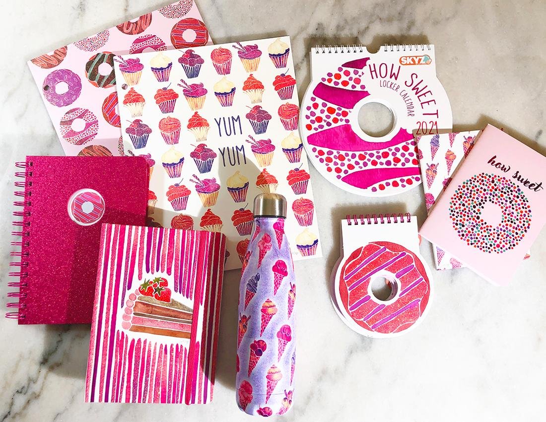
For example, I collaborated with Skyz on a collection of products that utilized a variety of different coordinating illustrations with the same theme and color palette.
There is a LOT that goes into creating a cohesive, strategic collection and I’ve written a few in-depth blog posts to help you create cohesive collections with your art.
How to Create a Mini Collection for Surface Design (includes a free tear sheet template!)
How to Design Blender Patterns for Surface Design Collections
How to Plan a Collection for Surface Design and Art Licensing
I hope these tips help you to build a stand-out portfolio! If you want to take a look at my portfolio and see how I’ve structured it and what kinds of motifs I’ve included, click here to take a look!


