Open by Mary
I had the opportunity to work with Kansas City's own Mary Schulte to design the branding for her new lifestyle enterprise, Open by Mary. Mary sources products from around the world to include in her curated collection of home decor and lifestyle pieces. She believes in the idea that items one selects for their home or as gifts should represent something special, so she seeks out products that invoke curiosity, inspiration, and above all, have meaning.
Mission Statement: Open by Mary is personal and heartfelt, with just a touch of whimsy. We hope you’ll stick along for the journey as we uncover the origins of ourselves and the things around us, evolve in the face of new challenges, cultivate moments of kindness in our daily lives, and strive to find the beauty in our surroundings. If you believe that Meaning is the New Luxury, you just might be one of us. We are Open.
VISUAL IDENTITY SYSTEM
Primary Logos:
Hand-Applied Stamp System:
Custom Otomi Pattern:
Open by Mary is about origins. Mary's designs and spaces all have meaning that stems from a story – the origin of a piece, the origin of a period or style, or Mary’s own origins.
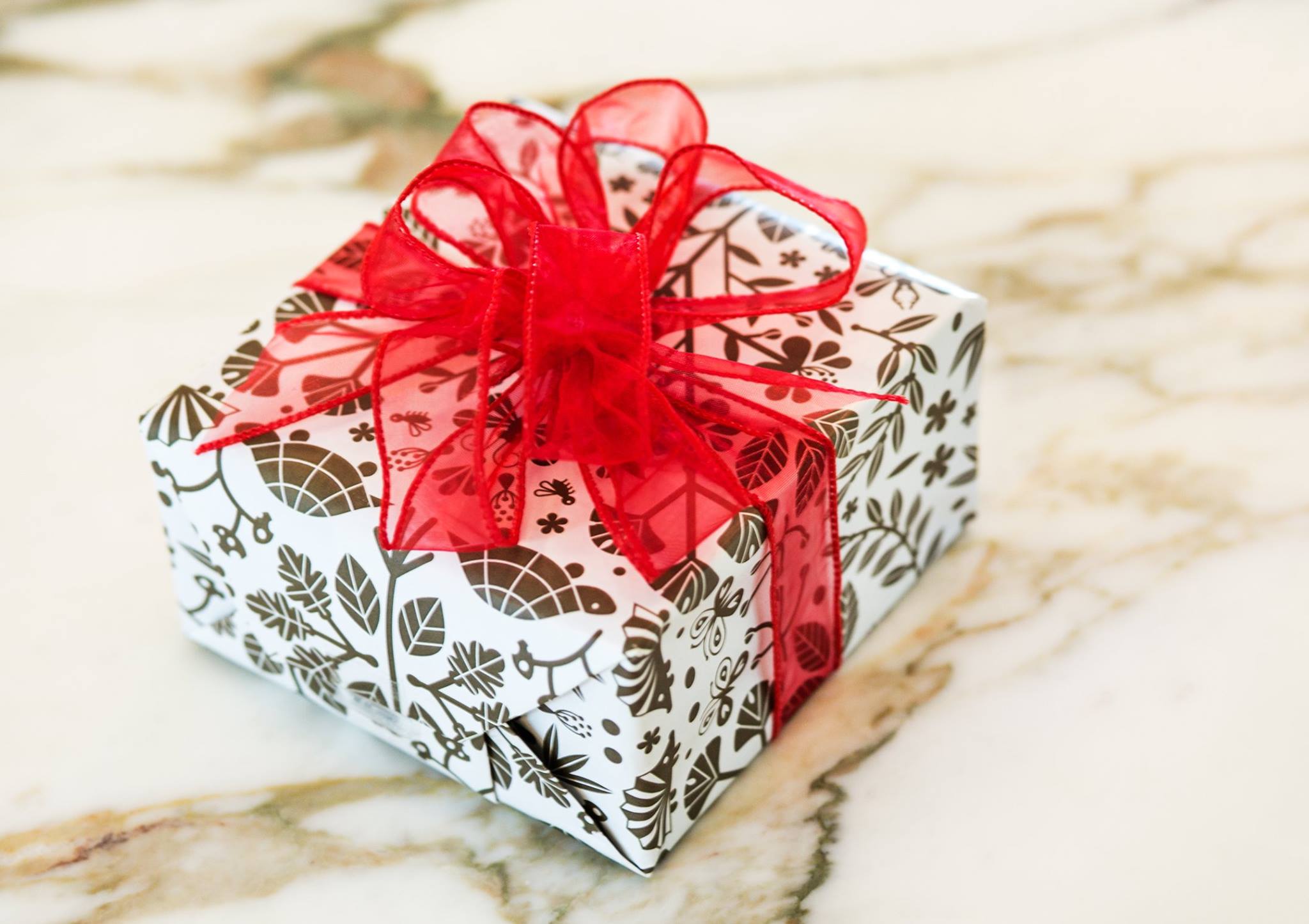
I designed a custom otomi pattern comprised of icons that have a deeper meaning to Mary; the dragonfly symbolizes her relationship with her late father, the cherry blossom branches are a nod to her preference for Eastern aesthetics, and the tortoise represents her husband's own founder story.
THE AESTHETIC
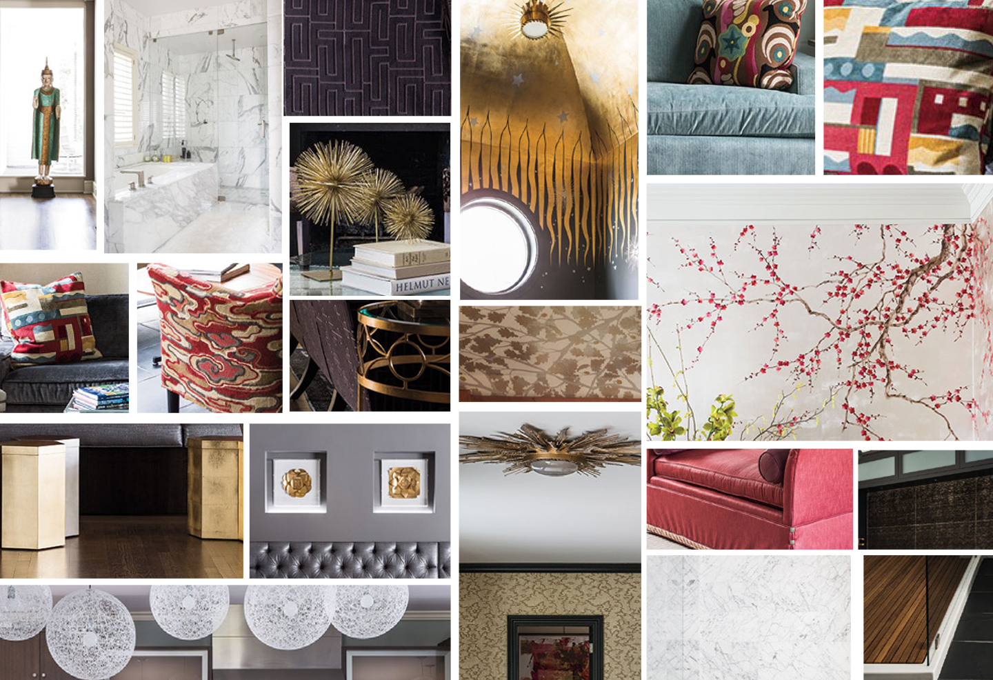
The visual concept for Open by Mary was inspired by Mary's own unique aesthetic. The collage below is comprised of snapshots of Mary's home. Mary’s aesthetic is defined by clean lines, continuity of design, and form following function.
Her design preferences are thoughtful and organized. While she takes her approach very seriously, she always leaves room for whimsy and something unexpected. We followed this same method for branding Open by Mary.
COLLATERAL SYSTEM
Advertising:
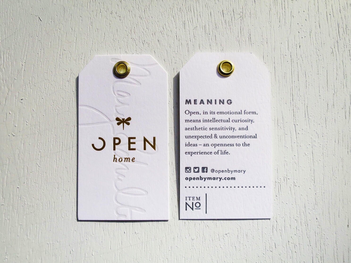
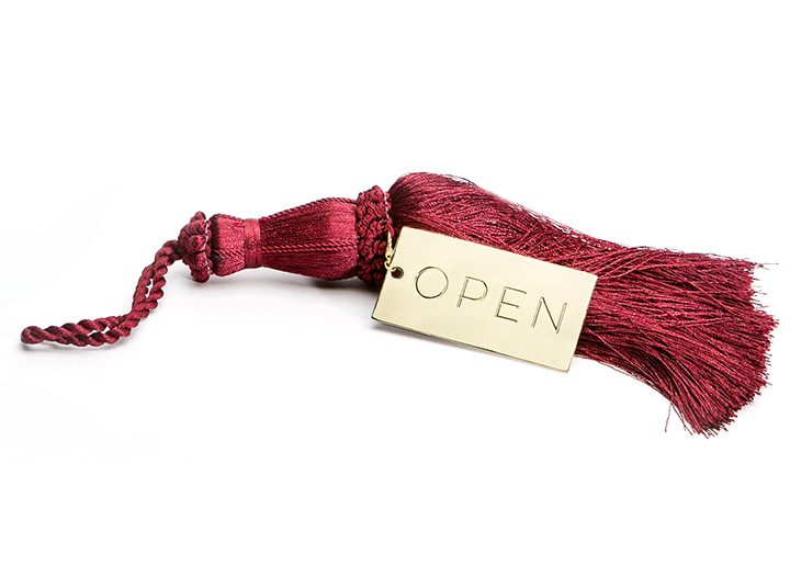
We wanted to ensure that Open's collateral system reflected the same degree of luxury and sophistication as the rest of the brand. I worked with KC-local letterpress shop Skylab Letterpress to produce the printed collateral.
We sourced the finest-quality paper, blind embossed Mary's own signature onto the product tags, letter-pressed everything and pushed the limits of applying incredibly intricate gold foil to incredibly small areas of paper. Thank you for the immaculate quality printing as always, Skylab! You guys nailed it.)
To get an idea of just how detailed the gold foil was, here's a penny for scale:
Website:
PRODUCTS
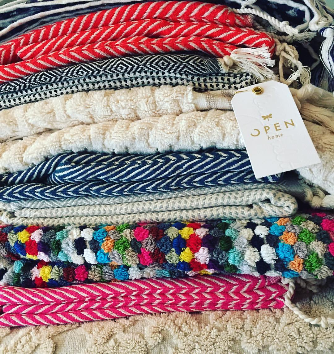
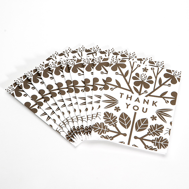
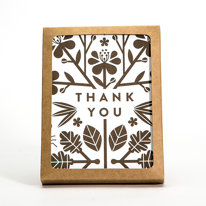
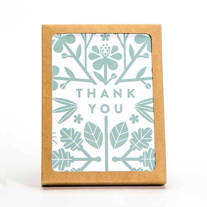
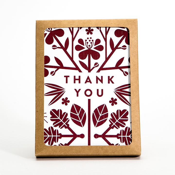
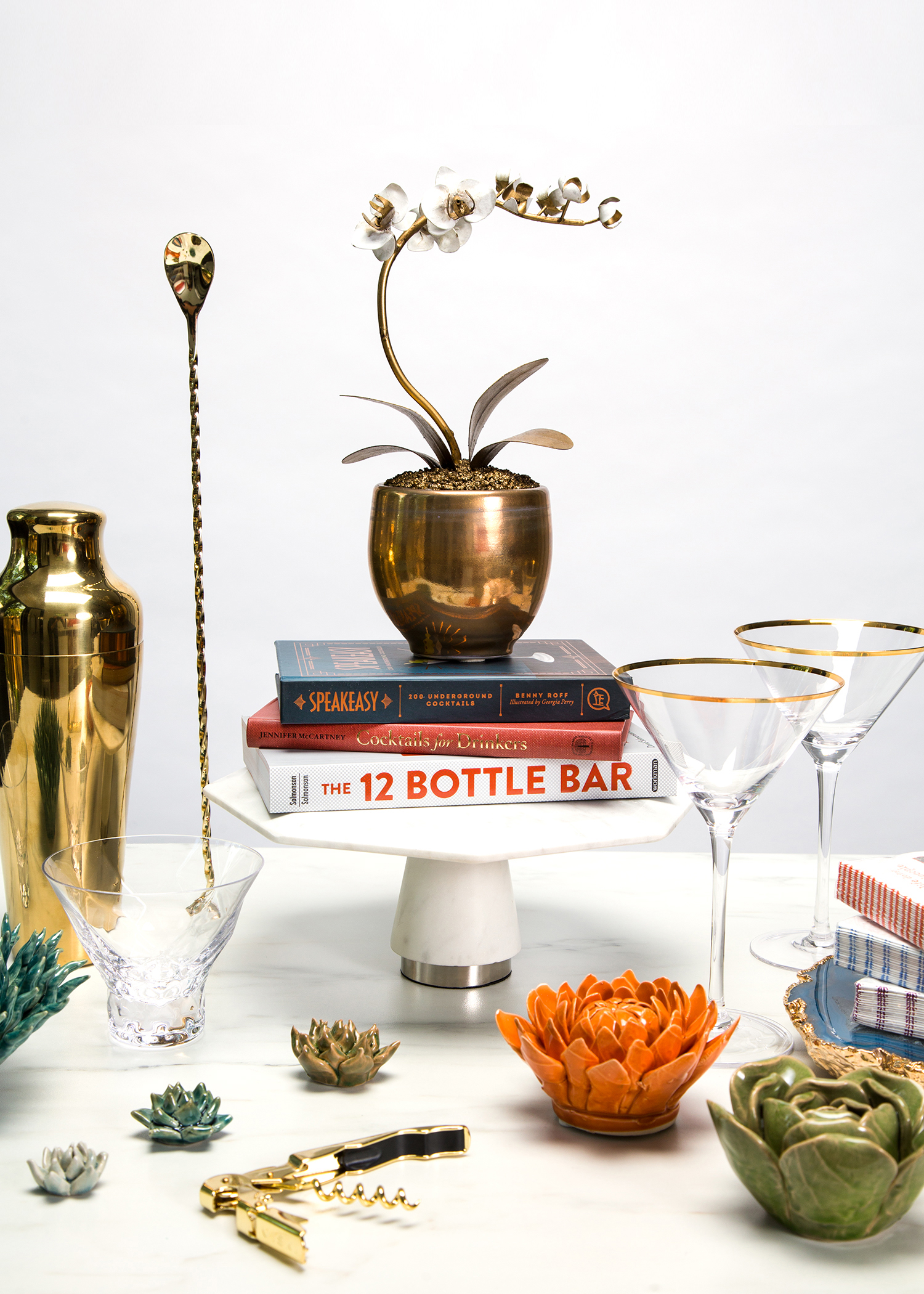
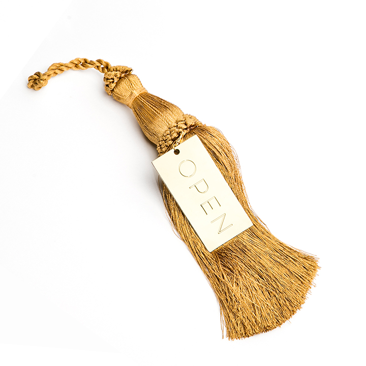
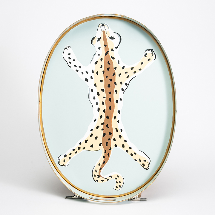
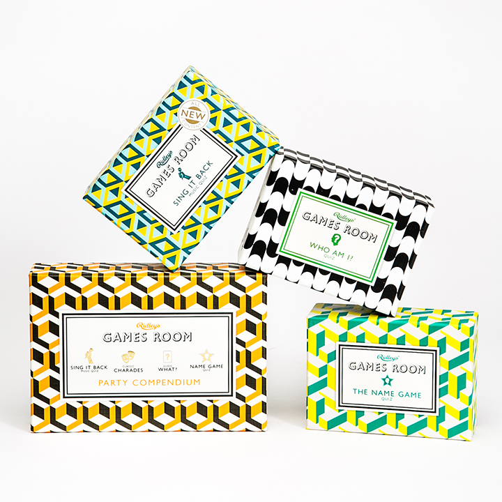
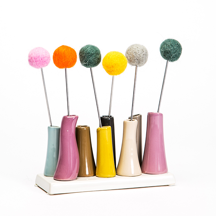
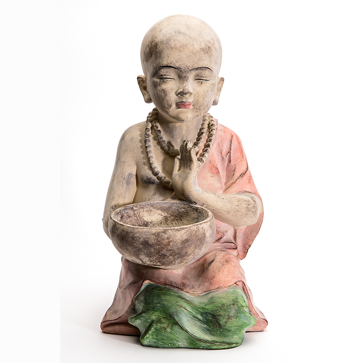
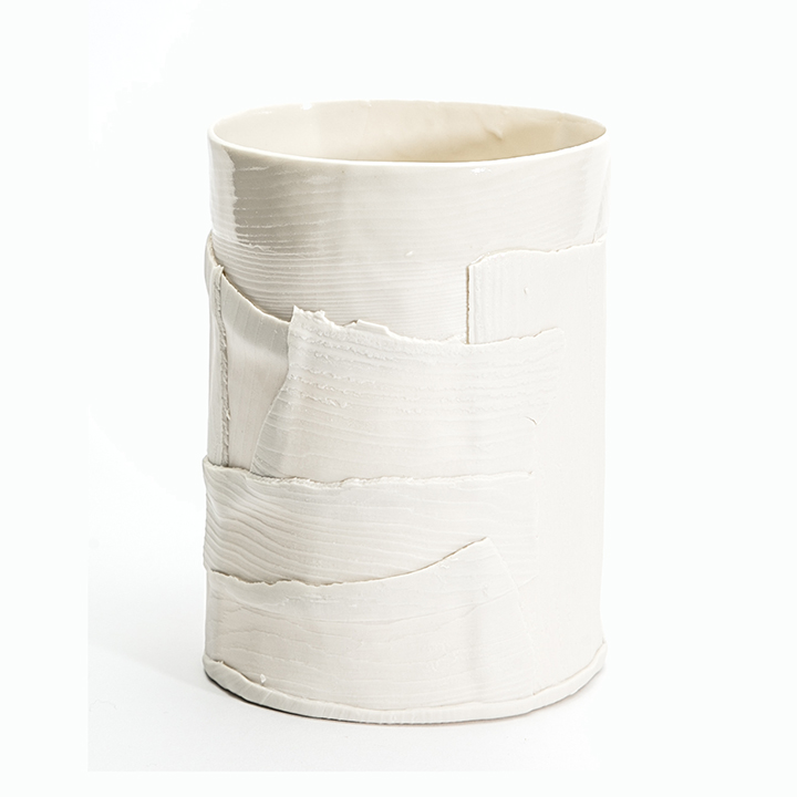
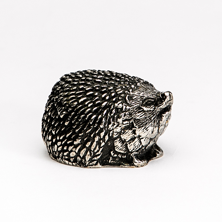
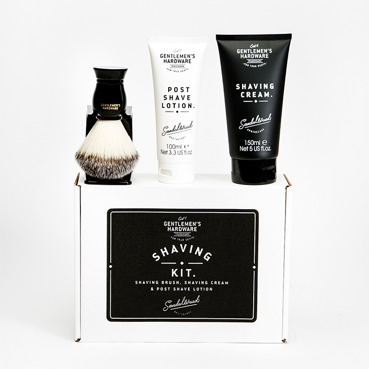
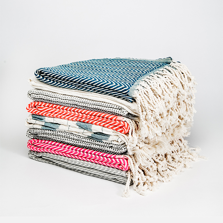
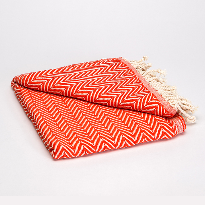
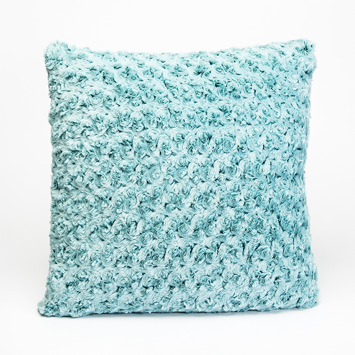
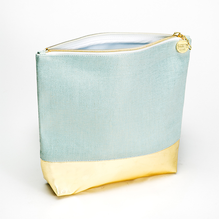
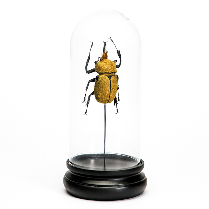
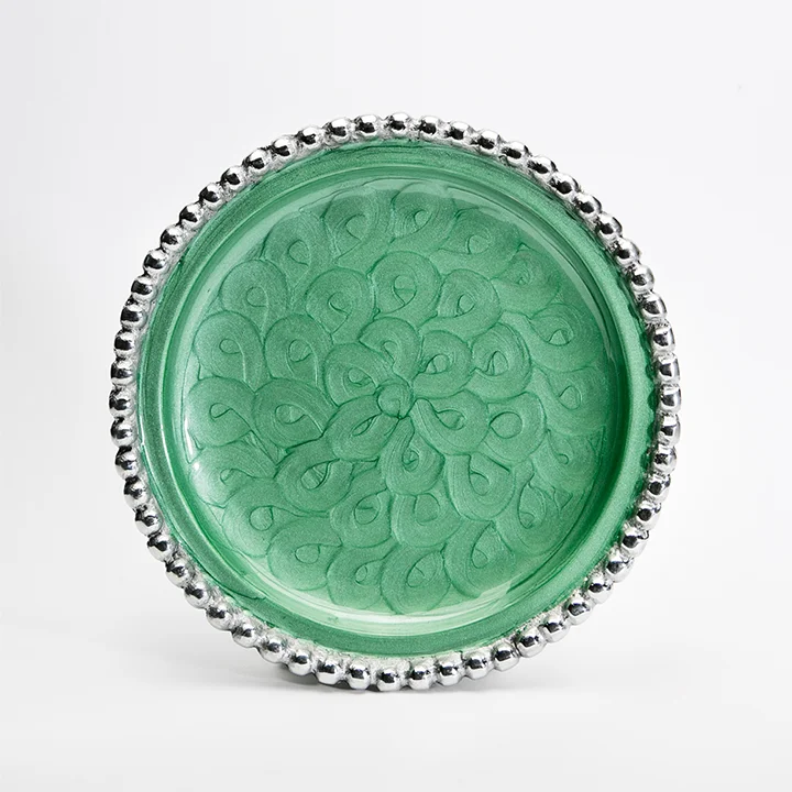
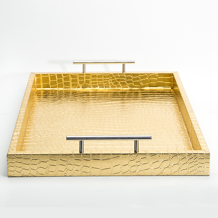
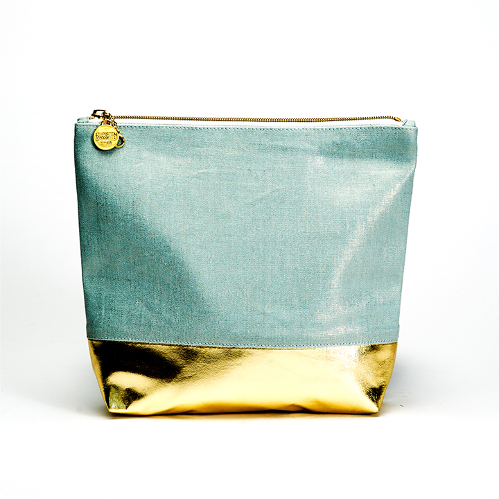
The branding system helps unite Open's products into a cohesive collection.
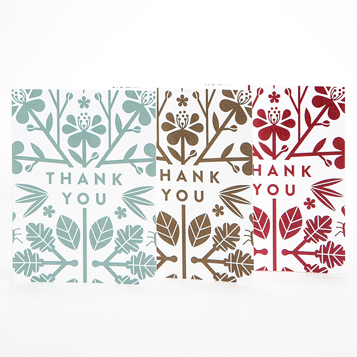
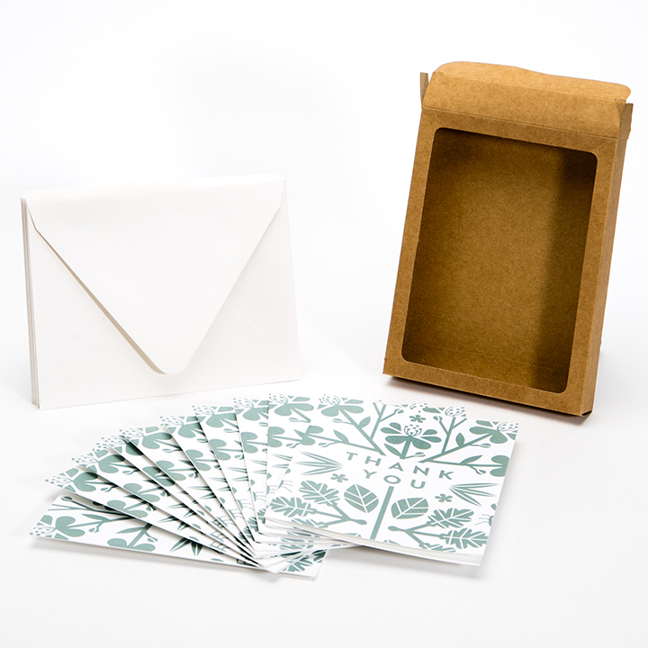
Stationery Set:
We turned Open's otomi pattern into custom wrapping paper.
Welcome to Open:
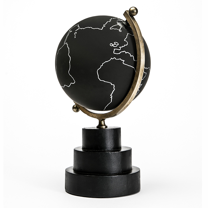
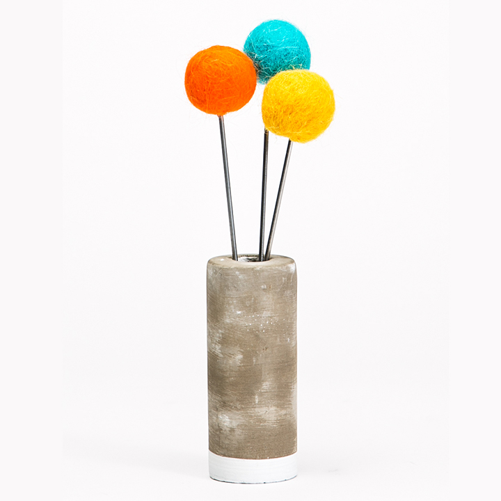
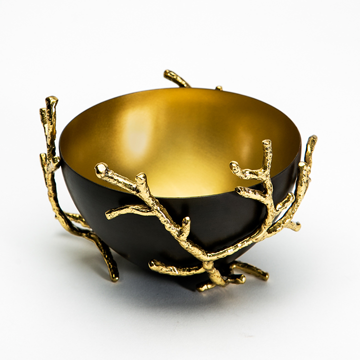
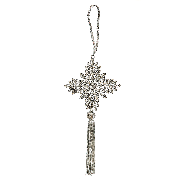
A Selection of Mary's Curated Collection
Meet Mary Schulte, Open's founder and chief curator.
Mary has an unexpected story. She has a Master’s Degree in Industrial and Organizational Psychology and worked in Investor Relations and Corporate Finance before turning to a creative endeavor. Mary has a keen eye for design and a passion for finding true meaning in the things that surround her. She has designed several homes, been featured in homes tours and magazines, resided on architectural and design boards, and works with artists, designers, and makers on a regular basis. She hopes to bring her style and thoughtfulness to the forefront of home design and living. In short, Mary is basically a dream client.
