Panera Holiday 2015
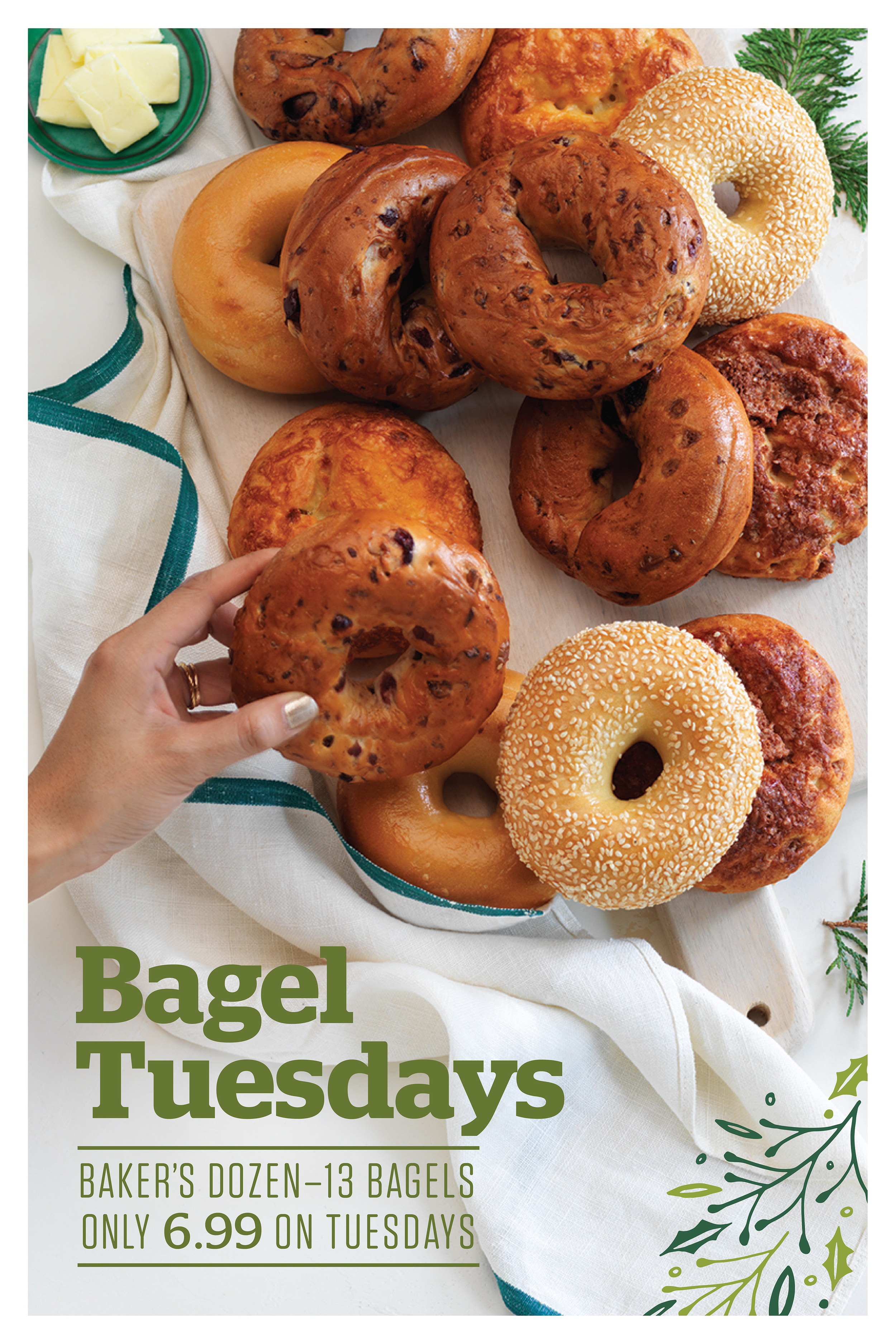
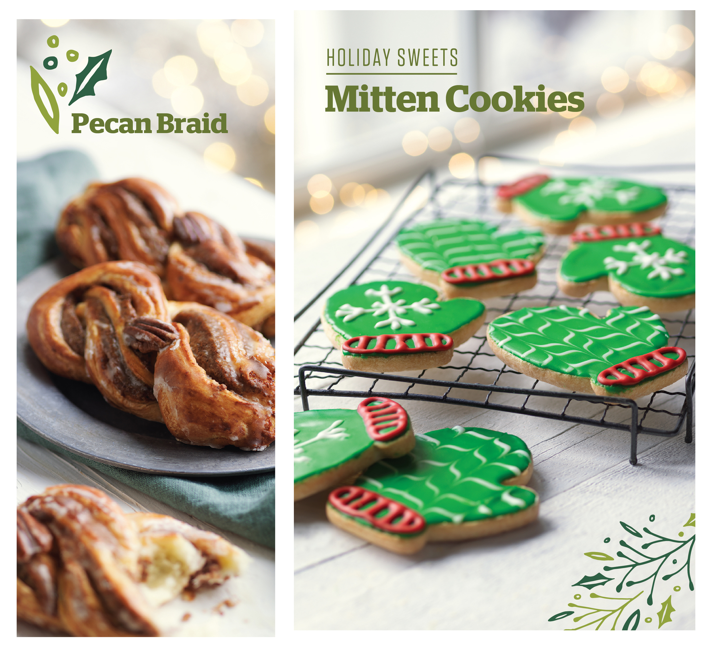
This is the fourth year that Willoughby Design has had the opportunity to lead the creative to Panera's holiday campaign. While employed with Willoughby, I had the opportunity to lead the creative as the senior designer for the campaign. We concepted the look and feel, art directed the product photoshoot, designed the in-store signage, and created Panera's unique holiday packaging.
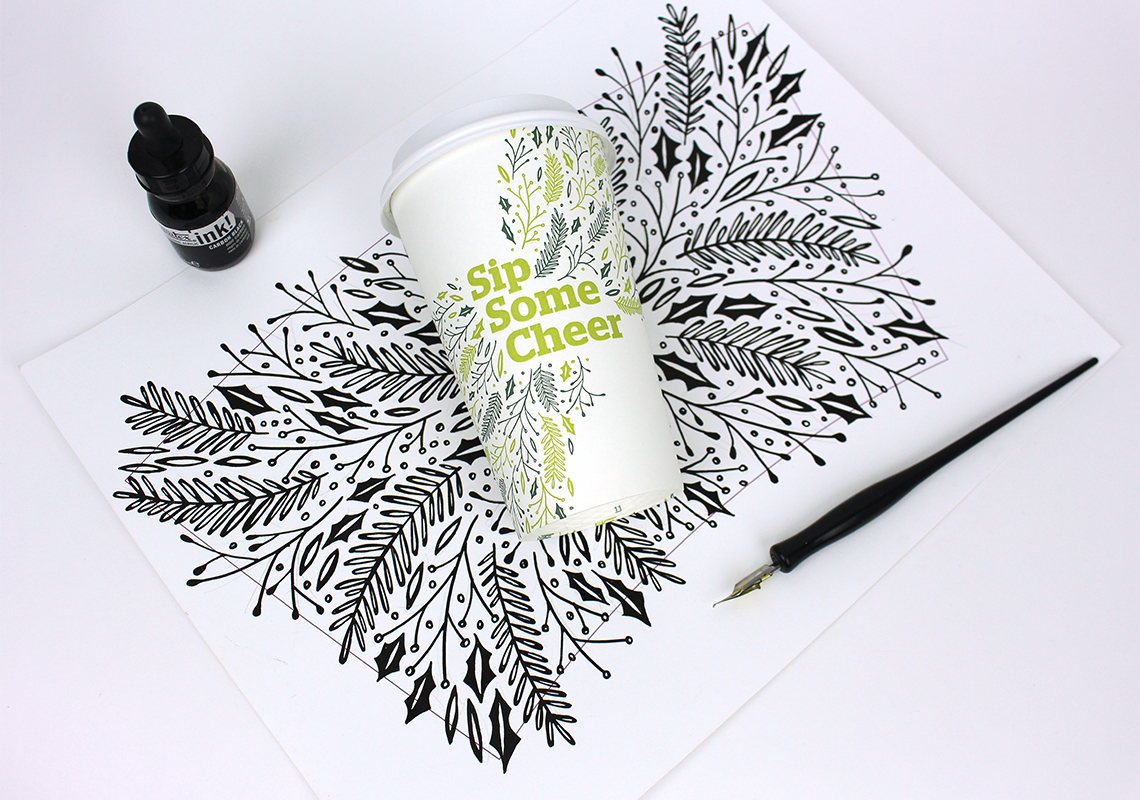
I hand-illustrated the entire campaign with pen and ink. Winter-themed foliage intertwines throughout the packaging and signage as a nod to the holidays. We chose a palette of evergreen and bright chartreuse to complement the Panera logo color. The overall vibe is fresh, lively, and intricate. We couldn't be happier with the final products!
Designed at Willoughby Design
Client: Panera Bread
Advertising Agency: Anomaly
Art Director: Zack Shubkagel
Designers: Cat Coquillette, Kevin Garrison
Photographer: Francine Zaslow
Packaging:
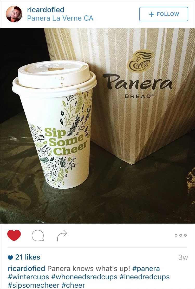
#SipSomeCheer
With such iconic cups + catchy copy, it wasn't long before the #sipsomecheer tag began to populate throughout social media. Here are a few of my favorites:
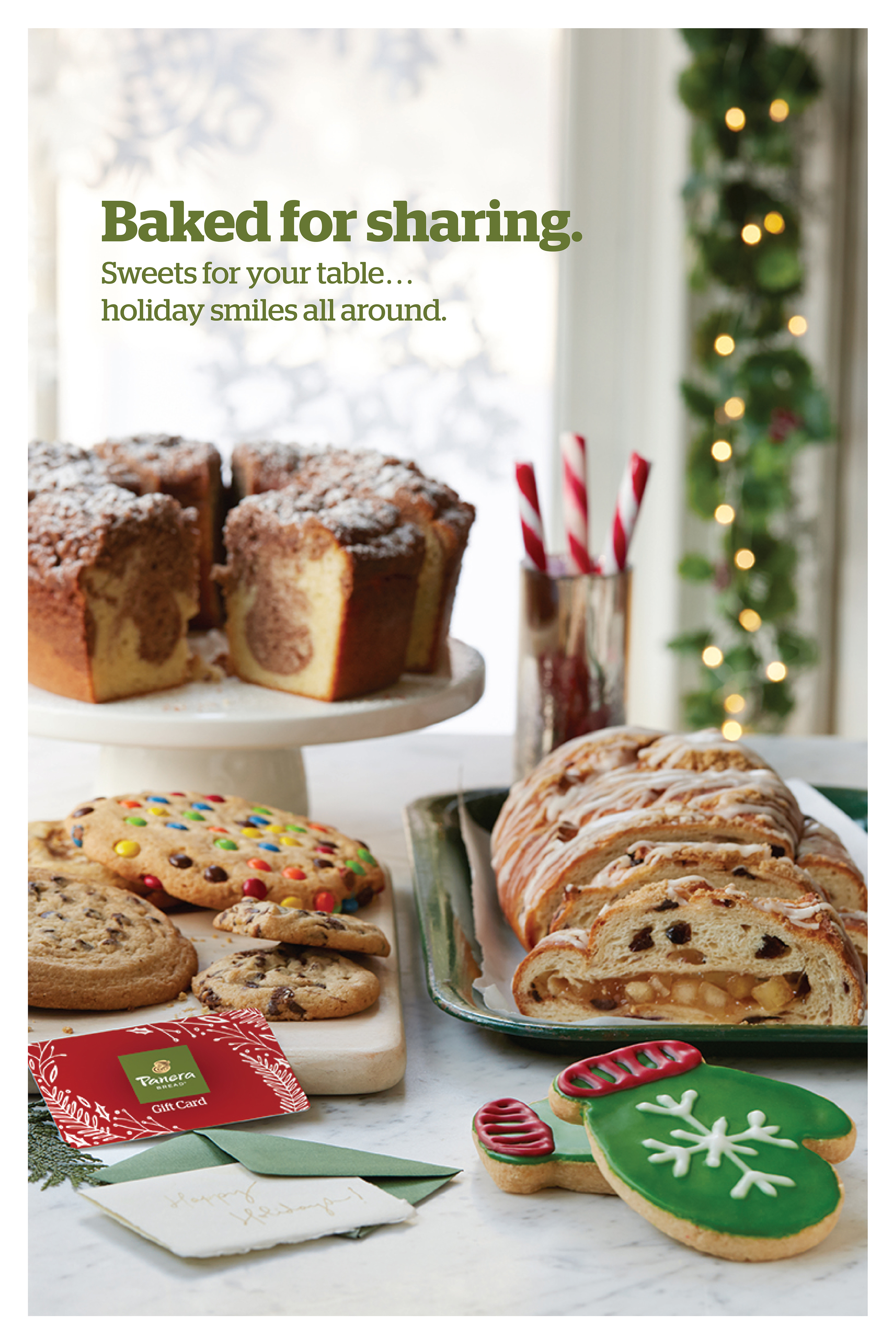
In-Store Signage:
Behind the Scenes:
I traveled to Boston, Massachusetts for our product photoshoot. While we typically shoot in-studio, this time we opted for something a little different and went on location. We chose a quaint house in Concord and took over the entire first floor. The natural and uncomplicated setting made for some stellar shots.
Our makeshift studio.
Frost-in-a-can = the solution to shooting holidays in August.
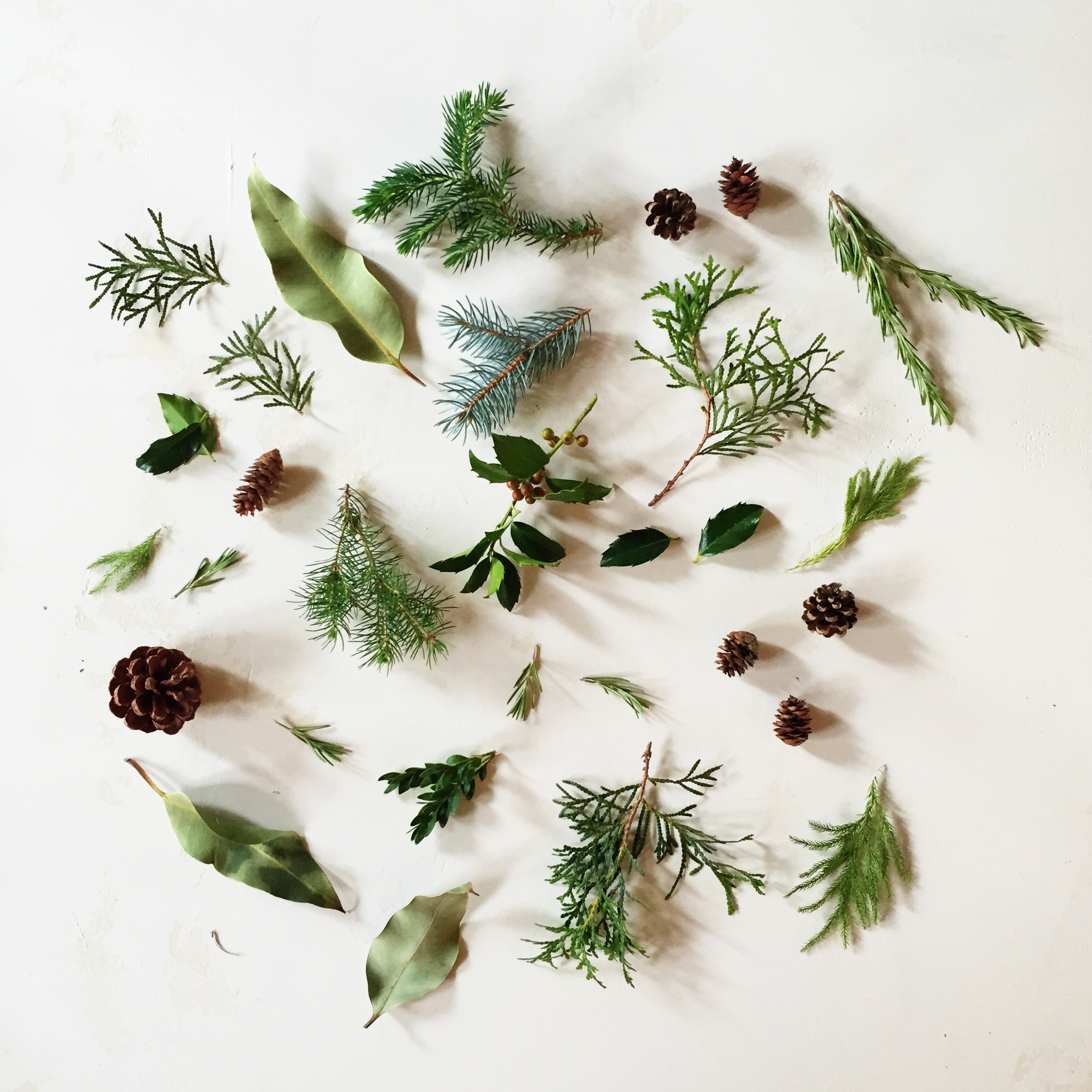
Our prop stylist, Martha Bernabe, was amazing. I still don't know how she managed to find so much winter foliage in August.
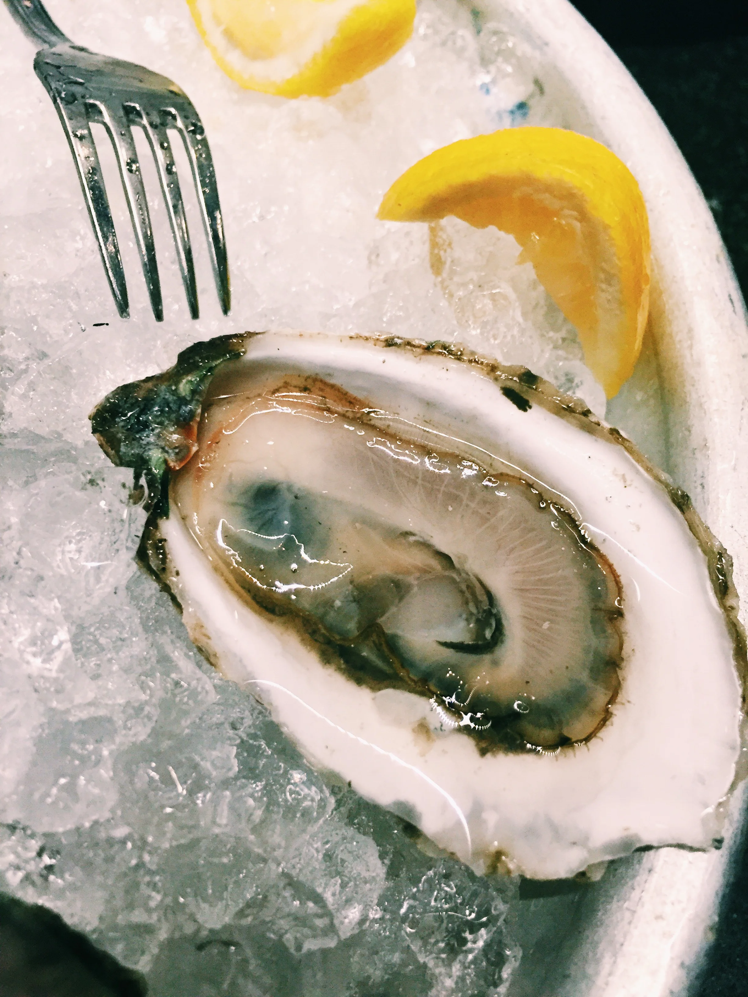
This is the #1 reason I love photoshoots in Boston.
Had to share this: I scored the legroom jackpot on the flight back home!
