Calligraphy and Brush Lettering Basics
In this tutorial, you'll learn how to do calligraphy and learn the basic calligraphy strokes that you can use to illustrate any phrase that you want. Lettering goes by many names whether it's calligraphy, brush lettering, or hand lettering, but the result is the same - beautiful lettered illustrations that share an inspirational message.
Hand lettered pieces are some of the best sellers in my portfolio. In fact, my hand lettered Shakespeare quote is what helped my brand take off back in 2014 and it's still one of my best sellers to this day.

Lots of people think that you have to have good handwriting to create hand-lettered illustrations, but that's not actually the case! I actually don't have great handwriting myself!
When I first started with calligraphy and brush lettering, it was helpful to think of the words and letters as illustrations, not just something you write on the page. Coming into it with this mindset will help you to create a beautiful hand-lettered illustration no matter what your handwriting looks like!
The key to creating a calligraphy look with your illustration is using light upstrokes and heavy downstrokes. If you only take away one thing from this tutorial it is that you should always use light upstrokes and heavy downstrokes when you're creating brush lettered calligraphy.
Supplies:
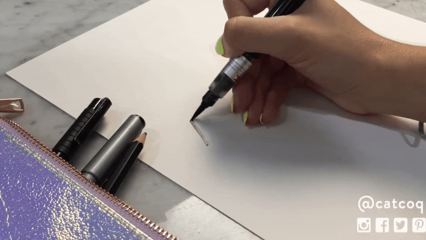
Before we get into the different brush lettering techniques that you can you use to achieve this light upstroke and heavy downstroke, let's talk about the supplies you'll need
Brush Pens
My favorite way to do hand lettered calligraphy is with brush pens. I typically use either a squeeze tube brush pen or a marker brush pen. These pens give you a huge amount of control with the light and heavy strokes and are super fun to use. This is my favorite squeeze tube brush pen to use. You can use any brand you like as long as the brush has a fine tip and is malleable enough so that when you apply pressure it creates those heavy downstrokes.
Paint Brushes and India Ink
Some artists prefer to use paint brushes to get a brush lettered look. If you're a painter and are more comfortable with brushes like this then you can absolutely use them to achieve the same look as you do with a brush pen!
Procreate and an Apple Pencil
I know that a lot of people love drawing digitally, and you can absolutely create beautiful hand lettered pieces on your iPad. Check out this blog post tutorial that is all about how to create a hand lettered piece in Procreate.
Calligraphy Techniques
You'll hear me say it a thousand times by the time we're through with this tutorial, but the key to calligraphy is the light upstrokes and heavy downstrokes of your letters. You can achieve this look in two different ways.
One is by angling the brush on your paper so that your downstrokes are heavier, and the second is by alternating the pressure that you are using when you're creating the letterforms. It depends on what kind of brush you're using, but generally, the angling technique works best when you're using a brush or pen that is less malleable. The pressure technique works best with a more flexible brush.
My favorite way to create calligraphy is by applying lighter pressure on the upstrokes and heavier pressure on the downstrokes. This is easy to achieve when you use a squeeze tube brush pen or marker brush pen.
Letterform Practice
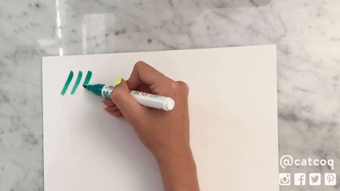
Now let's learn some different lettering strokes. These are all great to practice and will help you get the feel of lettering using heavy downstrokes and light upstrokes. I like to warm up with these different strokes and letterforms before I start a calligraphy project so I get used to the feel of my brush.

Angled Downward Stroke
The first stroke to practice is an angled downward stroke. Make sure to hold your brush at an angle and apply heavy pressure. This is the foundational downstroke that you'll use no matter what type of letterform you're creating.
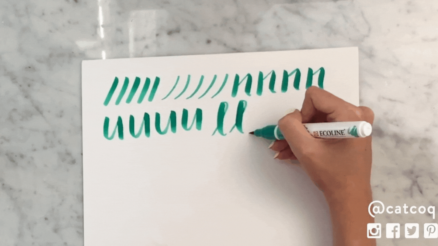
Light Upward Stroke
This stroke is significantly thinner than the heavy downstroke. The key to achieving a calligraphic look is the variation between the upstroke and downstroke.

Lowercase "n's"
Now let's connect these two strokes and practice some lowercase "n's." This is a great introduction to connecting the light upward stroke with the heavy downward stroke. Take your time practicing this and getting comfortable with the two strokes together.

Lowercase "u's"
The inverse of the "n" is a lowercase "u." This will give you some extra practice transitioning the strokes in the opposite direction.

Cursive "L's"
This is a great stroke to practice to learn how to transition seamlessly from the heavy downstroke to the light upstroke. Plus, it's so satisfying and therapeutic!
Letter "O"
The most advanced letterform to practice is an "O." A lot of people have trouble with shape and maintaining the thick and thin strokes, but it really just takes some time and practice to master this skill. If you've made it through these first few strokes, you'll definitely be able to get this one too, it just might take a little extra practice!

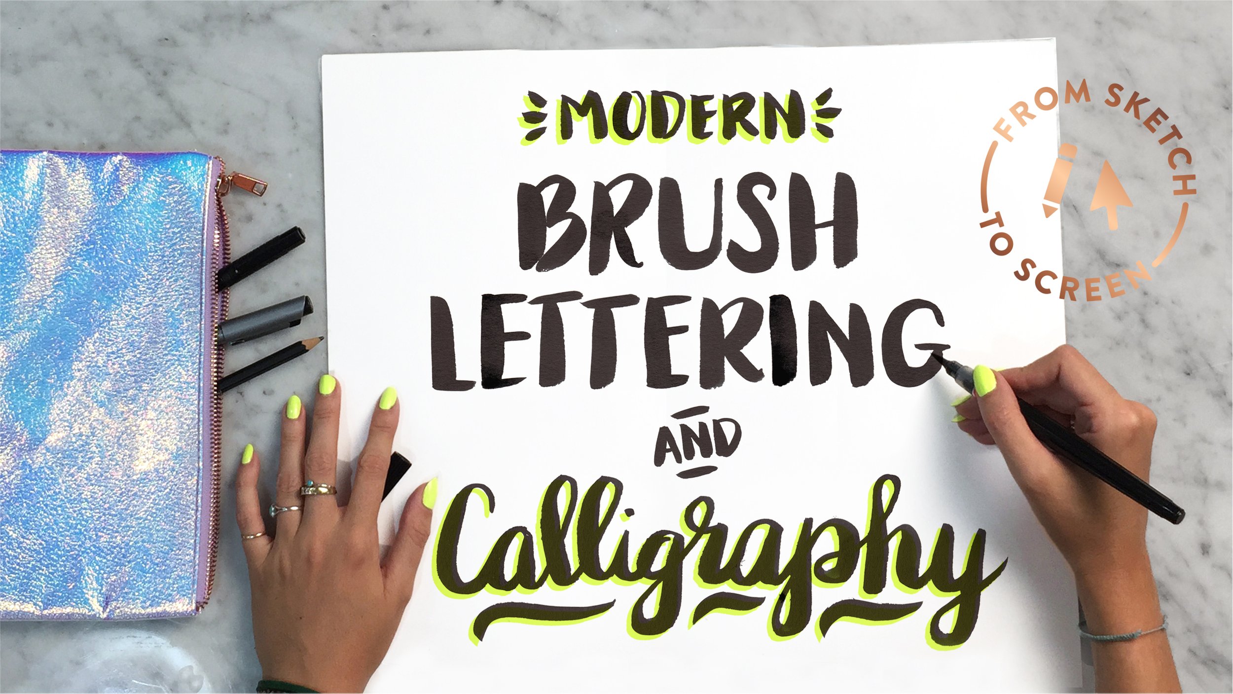
From here you can use these foundational strokes to create any kind of hand-lettered piece you'd like! These are applicable whether you're doing a sans-serif lettered piece or cursive lettering. In this example, I lettered the phrase "Enjoy Today" using both cursive and sans-serif letterforms, but you can see that the heavy downstroke and light upstroke applies to both types of lettering.

This tutorial introduced you to the main concept of calligraphy and brush lettering, but if you want to dive even deeper and learn how to create a full hand lettered piece, join me in my Skillshare class Modern Brush Lettering and Calligraphy.
In this class I teach how to create a full brush lettered piece including how to create a thumbnail sketch, tips for keeping your lettering even on the page, and even how to digitize and recolor your hand lettered piece using Photoshop. I even throw in a free lettering practice worksheet and free downloadable metallic textures exclusively for students of the course.
And the best part? You can enroll in the class for free when you sign up for a free trial with Skillshare. Click here to enroll now!
I hope you enjoyed this brush lettering tutorial! If you have any questions feel free to leave them in the comment section!