How to Quickly Adjust the Color of Your Illustrations in Procreate
There are a lot of benefits to having various colorways for your artwork. It’s great for increasing the amount of artwork in your portfolio, it helps your chances with art licensing deals, and it’s fun to do! The task of creating your artwork in a different color palette may sound like a tedious job, but Procreate comes to the rescue with a fantastic array of tools designed to make adjusting colors a breeze!
In this blog post, we're about to embark on a colorful journey together in discovering the art of quickly adjusting the color of your illustrations in Procreate.
Supplies:
All you need to get started with adjusting the color of your illustration in Procreate is the iPad app Procreate, an iPad, and an Apple Pencil! (Click here to check out the iPad I recommend!)
First Things First…
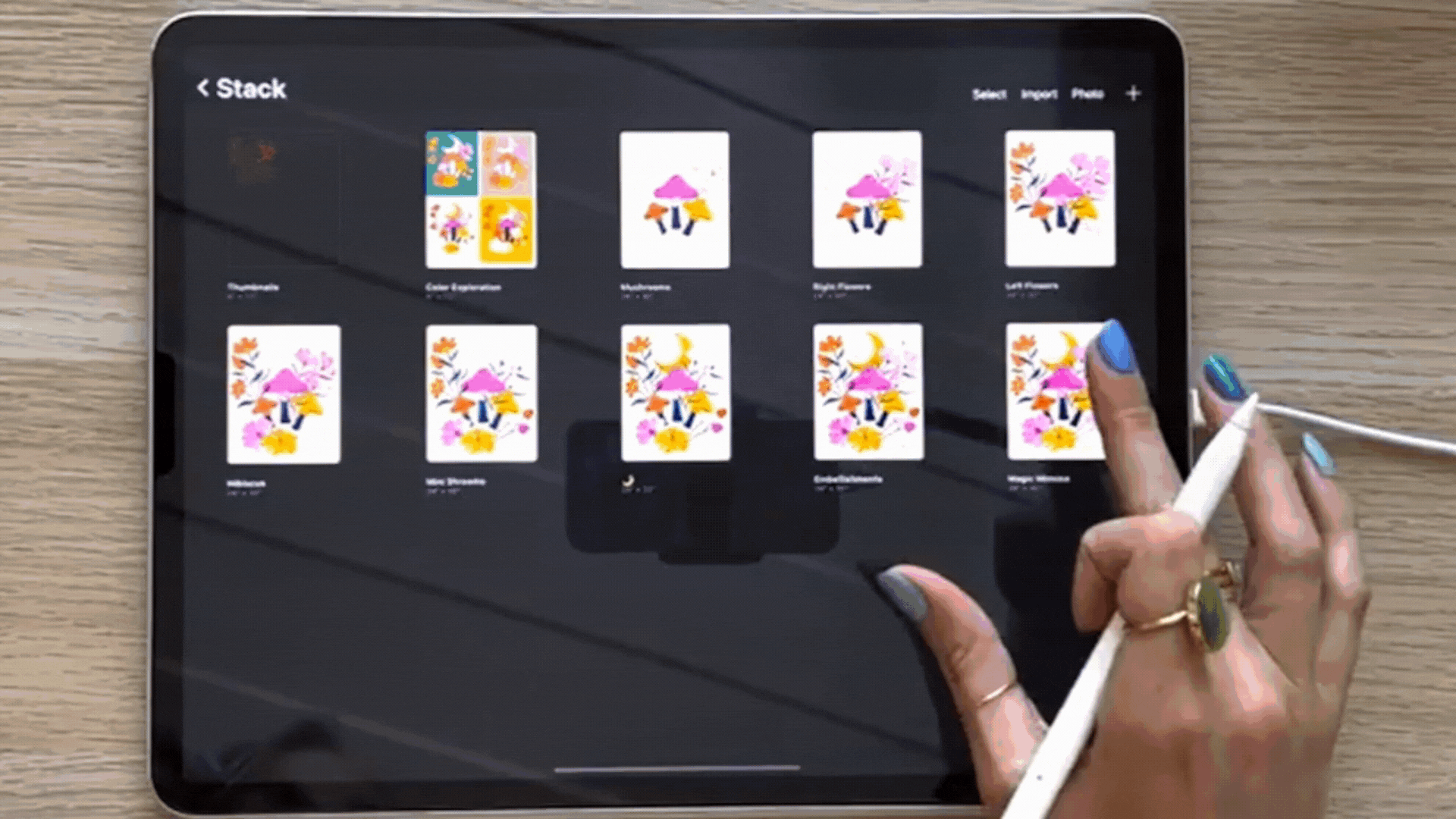
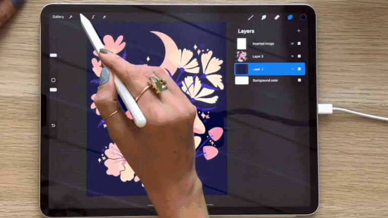
Your original illustration is the best place to start, so the first thing you need to do is duplicate it and rename the original file. This will keep things organized and allow you to keep your original illustration intact. Non-destructive editing for the win! I like to duplicate the file for each new color variation I make. You can be creative with how you name each color variation– it can be as simple or as unique as you want it to be.
Prepping Your File
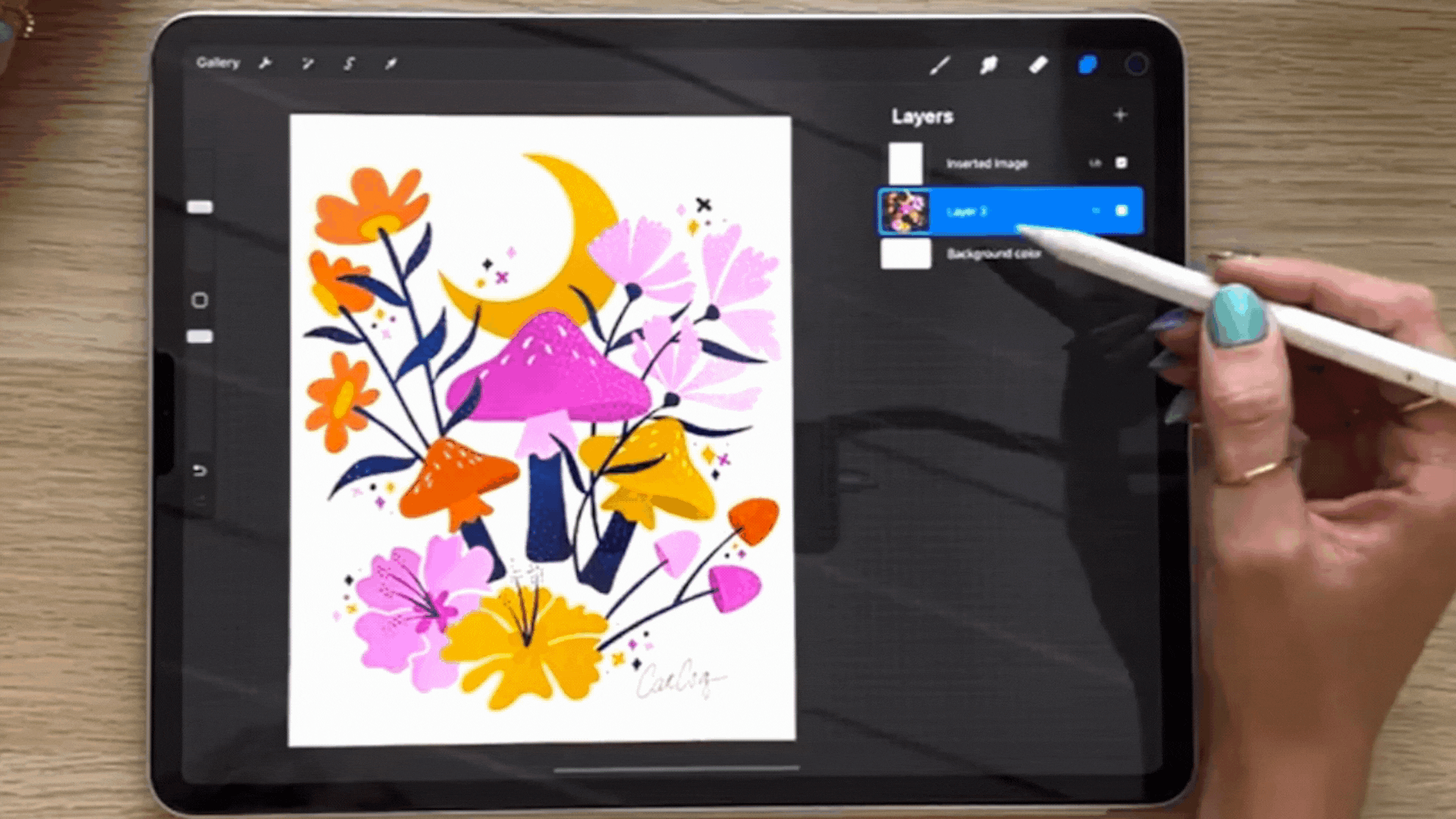
Once you’ve duplicated your original artwork, you can go ahead and open the file. To prepare your illustration for easy color adjustments, you’d want to flatten all the layers except for the background layer and the texture layer (if you have any).
Once this is done, we’re ready to start playing with colors!
Changing the Background Color
Changing the background color might seem like a simple adjustment, but it can make a massive difference in your artwork. There are a couple of easy ways to change your background color. And oftentimes, just changing the background color results in a really cool new colorway for your illustration. So with one simple adjustment, you have two illustrations instead of one!
Adjusting the Default Background Layer
The first method for changing the background color in Procreate is to tap on the layer named “Background Color” by default. This will open up a color interface where you can pick the color of your choice.
Although usually, consistency is an important aspect of art– in this case– it’s best not to pull color from the same color palette as your illustrations. If you use any of the background colors from the same color palette as your artwork, some elements might get lost.
Creating a New Background Layer
Another way to change your background color is by creating a new layer. You can do this by tapping the plus sign (+) on the top right corner of the Layers Panel and then dragging the new layer under your illustration.
Once the layer is in place, all you need to do is pick, drag, and drop the color onto your canvas.
Using the Gradient Map
The Gradient Map Tool is an excellent way to apply a dynamic color scheme to your entire illustration. Here's how to use it:
Make sure that your flattened illustration layer is selected, then tap on the Magic Wand tool which is right beside the Settings or the wrench icon on the top left side of your Procreate interface. Next, you need to tap on “Gradient Map”.

This tool opens up a library of different color palettes that you can try and use. You can see the changes in your illustration in real time. All you have to do is tap on the color gradient that you like.
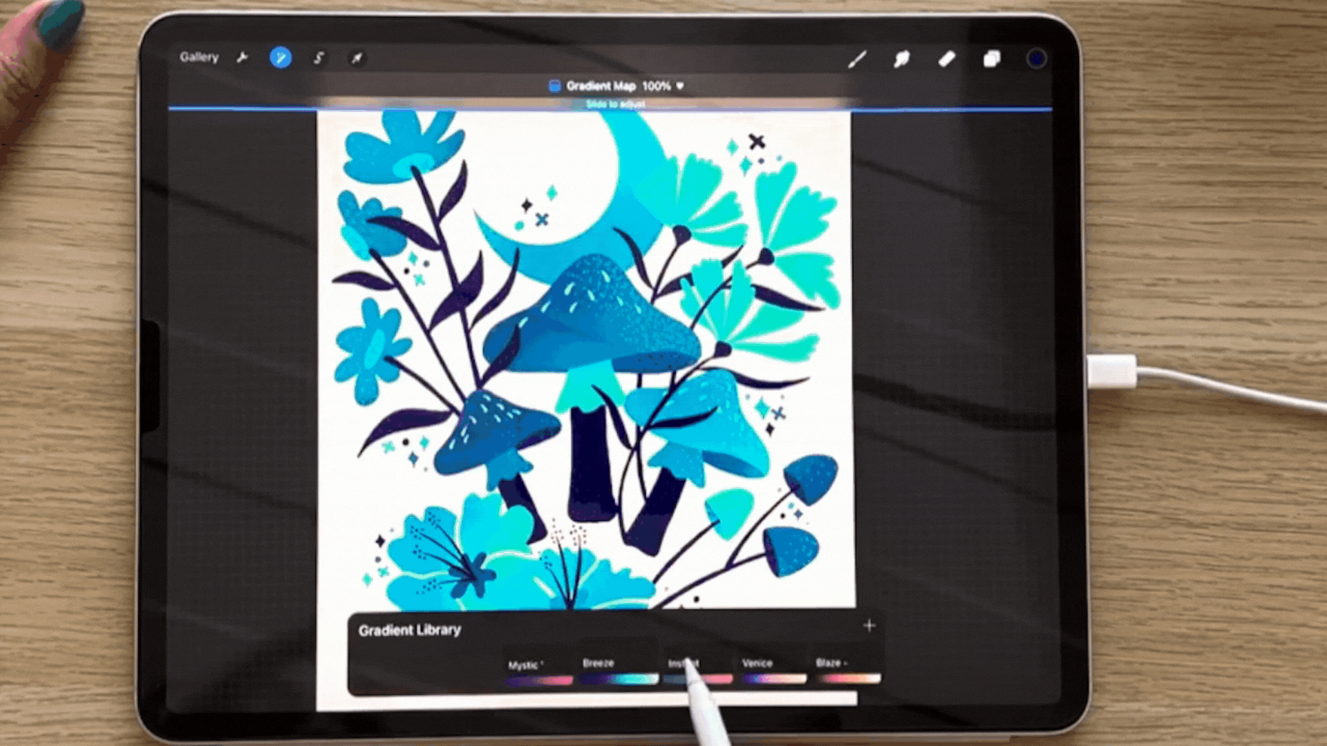
Procreate will automatically map the colors in your gradient to the values in your illustration, creating a visually cohesive look.
You can tap on the Magic Wand tool again once you’re ready to lock in a color scheme.
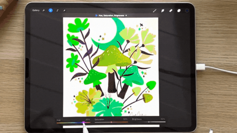
Adjusting the Hue, Saturation, and Brightness
Adjusting the hue, saturation, and brightness is a great way to explore the color possibilities for both your background and illustration colors. Select the layer that you want to play with then tap on the Magic Wand tool. Once again, this opens up the Adjustment options but this time you need to select Hue, Saturation, and Brightness.
This is another good opportunity to see in real-time what color differences could look like for your illustration and what colors work for your art. This tool allows you to see a lot of options all at once with just subtle changes to the saturation, hue, or brightness. You can also use this tool to fine-tune the colors of your final output. Once you're happy with the selection, tap on the Magic Wand tool to lock in your choices.
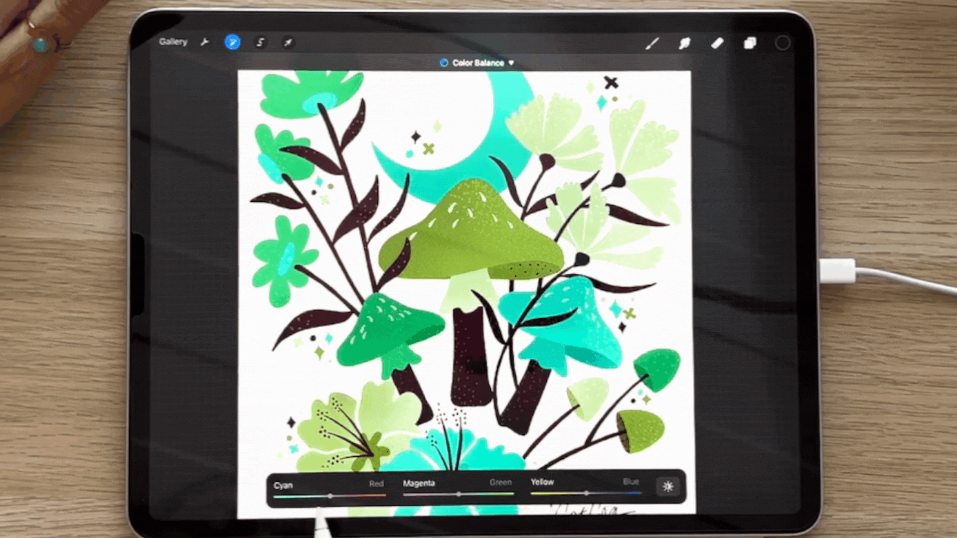
Exploring Color Balance
The last tool you can use to quickly adjust the color of your illustration in Procreate is the Color Balance tool. You can access it through the Adjustments panel as well.
This tool best works on your illustration since it’s a great way to explore and fine-tune the color tonality of your artwork.
Select the illustration layer and tap on Color Balance from the Adjustments panel. You can select which aspect of the illustration you want to focus on – Shadows, Midtone, or Highlights. You can then adjust the levels of Cyan, Magenta, and Yellow on your art until you’re happy with the results.
With Procreate's powerful tools for color adjustment, you can quickly and effectively transform the look and feel of your illustrations to create brand-new colorways and grow your portfolio.
Whether you're changing the background color, applying gradient maps, fine-tuning with Hue, Saturation, and Brightness adjustments, or adding some nuance using the Color Balance tool, Procreate provides you with the creative freedom to experiment and achieve stunning results. So, go ahead and unleash your artistic potential by playing with colors in your digital illustrations!
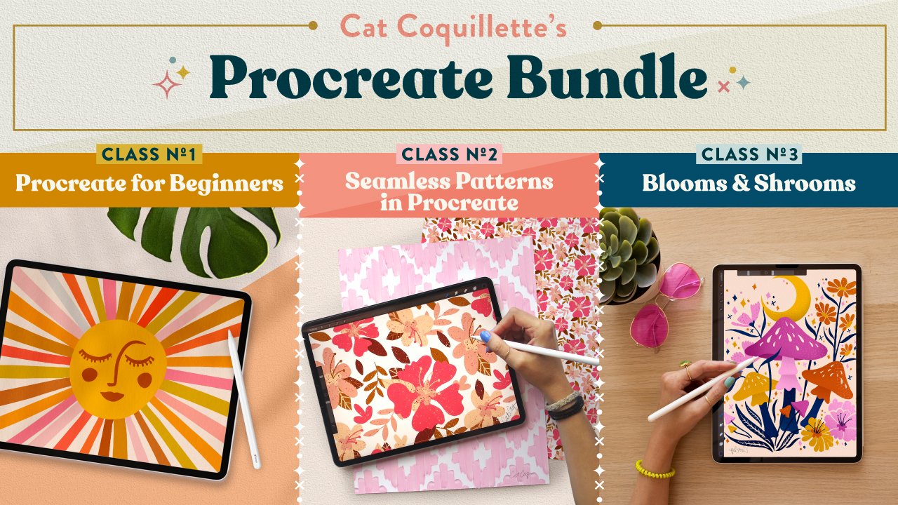
Want to learn more Procreate tips to take you from beginner to surface design professional? Get my Procreate Bundle and snag my three most popular Procreate courses for a low bundled price. I’ve taught over half a million students how to master the art of illustration in Procreate, and I’d love for you to join me in class!