How to Create a Mini Collection for Surface Design
In the world of surface design and art licensing, there is a common debate about how many pieces to include in your collections. The often touted “industry standard” of at least 12 pieces per collection is daunting, to say the least.
But I have good news! You don’t have to design huge collections to be successful in art licensing. Enter, mini-collections! Read on to learn how to use this simple collection technique and snag my free mini-collection tear sheet template!👇
Why it’s important to design in collections
Before we talk about mini-collections, let’s back up a bit. What is a collection in the first place? A collection is a grouping of related artwork. It can include patterns, standalone illustrations, or both!
Designing in collections is important if you want to get your work licensed because it gives your potential licensing partners more options to sell on coordinating products.
What is a mini collection?
A mini collection is simply a smaller collection – typically 3-8 pieces. These collections usually focus on a few main illustrations supported by simple blender patterns.
Mini collections are great, especially if you’re new to the world of surface design. Designing a massive collection is a big undertaking, but creating a mini collection is an accessible way to get comfortable creating collections without feeling overwhelmed.
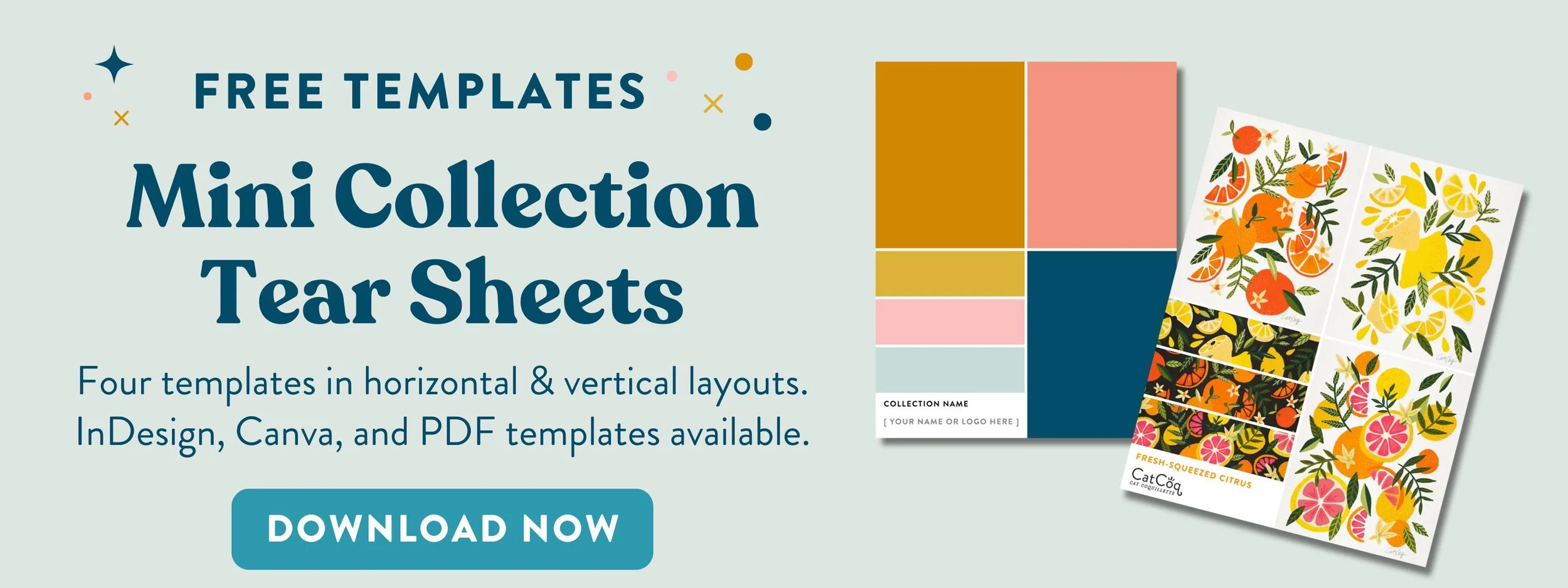
👇 The best way to display your mini collection? A tear sheet! 👇
My Top Mini Collection Tips
Pick a theme
Your theme is the central motif and the most important part of a cohesive collection. Your artwork doesn’t all have to match perfectly, but it should all fit under the same thematic umbrella.
Keep it cohesive
Make sure your pieces look like they belong together. Whether that is with the medium you use or a consistent color story, your work needs to look cohesive.
Include blender patterns
A blender pattern is a simple pattern related to the theme and subject of your collection. Adding super simple blenders is one of the quickest and easiest ways to make your mini collection more strategic and enticing for licensing partners.
Take stationery for example: The hero illustrations from your collection will be front & center on greeting cards. The blenders act as a cute accent for envelope liners. You could pitch the hero illustration on its own, but if your potential licensing partner was looking for accenting artwork, they might pass over your work if it doesn’t include supporting pieces like blender patterns!
Share your mini collection in the best possible light
Mini collections are typically pitched using a tear sheet (aka a one-page document with your artwork, your logo, and the collection name).
Presenting your artwork this way allows art directors to view your collection quickly without any friction. I put together a free tear sheet template for you with tear sheets in a horizontal and vertical format. The horizontal template is best for pitching to art directors who will likely view your collection on their computers. The vertical template is great for sharing on social!
Breaking down my mini-collection strategy:
Let’s take a look at some of my mini collections and the strategy behind them
Retro Remix Shoes
This mini-collection includes three hero illustrations to give it a bit more selling power. Notice how they all fit the theme but aren’t exactly the same. I added a few simple blender patterns that fit in with the retro vibe, but are still fairly simple so that the heroes can shine.
In this example, I made it extra cohesive by creating the blenders using elements from the hero illustrations. (Daisies and Xs). This really drives home the fact that these belong together!
Last but not least, I used the same color palette across all the illustrations to make everything come together.
Fresh Squeezed Citrus
This is a slightly different technique for showcasing a mini collection. There are still three hero designs, but instead of blender patterns, I created more complex supporting seamless patterns from the elements in the hero illustrations
This shows two strong applications for the designs in each colorway – stand-alone illustrations for wall art, stationery, etc. And seamless patterns for wallpaper, gift wrap, fabrics, and more.
Another strategic move was to show the standalone illustrations on a white background and the patterns on a dark background. This shows how versatile my design is. It works on both light & dark backgrounds! By showing both, I'm also adding contrast to the collection so the whole thing isn't too matchy-matchy.
Ready to create your own dazzling mini-collection?
Don’t forget to grab my free tear sheet templates so you can easily display your collection in the best possible light!


