How to Change Colors in Photoshop and Create Multiple Colorways
One of my favorite techniques for success in selling art online and licensing my artwork as a professional artist is to create multiple colorways or color palettes for each piece of artwork I create. In just a few clicks I'm able to transform one piece of artwork into many. Not only does this save time, but it helps my portfolio grow exponentially and increases the number of potential buyers for the art I sell online.

The beauty of art is that different styles and colors appeal to different people. Creating a piece in multiple colorways increases the appeal of that artwork and allows me to reach a wider audience of customers.
Color can feel intimidating, but there are some easy tricks I use in Photoshop to make changing the color of your artwork a breeze. I use Hue & Saturation, Color Balance, and Colorize in Photoshop to make changes to the color palette of my artwork, and in this Photoshop tutorial, I'll take you step-by-step through my color process. Creating a new color palette for an illustration doesn't have to be time-consuming. It's actually really simple! In this tutorial, I'm going to walk you through my top tips for adjusting the color of your illustrations for maximum selling potential.
All you'll need for this tutorial is a digitized piece of artwork and Photoshop. If you don't have Photoshop yet, no problem. You can download a free trial here.
You can use your own artwork for this tutorial, or you can follow along using this butterfly illustration that I created. This is what I'll be using for the tutorial. You can download it for free here. Plus, it's formatted as a Photoshop file, so all you'll have to do to follow along is download it and pull it up in Photoshop.

One last thing before we dive in. If you're more of a visual learner, it can be easier to learn about color in video format. I have an extensive and comprehensive color class available if that is more your style.

Ready to make different colorways from your artwork? Let's dive in!
Prep Your Artwork
Before you get started actually changing the colors of your artwork you'll want to make sure that your piece is prepped and ready to go. Start by opening up your artwork in Photoshop. You want to make sure that your illustration is on a separate layer than the background. In my example, I have three layers, the artwork, the background, and a paper texture.

The paper texture is just a little something extra that I like to add to my digital pieces to make them look more hand drawn. It won't be important for this tutorial, but if you want to learn more about adding a paper texture to your artwork check out this tutorial.
If your artwork and background are on the same layer and you're not sure how to separate them, I have a tutorial for that too! Check out this tutorial on removing backgrounds in Photoshop!
If you're following along using my butterfly illustration, your layers will already be set up correctly.
Next, we want to group the art layer and the background layer together. This just keeps things organized and will help you as you're creating the different colorways. Click on your art layer then hold shift and click on your background layer. Use the keyboard shortcut cmd + G to group the layers together.

Now you can rename that group so that you know it's the original color palette of the illustration. In my example, I'm naming it "Original." This is what your layer group should look like when you're done.

Initial Color Exploration
Now it's time for the fun part - color exploration! When I am starting the process of creating multiple color palettes for my artwork, I always start by playing around in Photoshop with different color tools. This allows me to see different color possibilities that I might not have thought of by simply picking a color palette out of thin air. It's a great way to warm up and get your color creativity flowing.
Before you start your color exploration, you want to make a copy of your "Original" layer group. You can do this by clicking the layer group and using the keyboard shortcut cmd + J.

I am all about non-destructive editing, so any time you're making color changes to your work always, always, start by making a copy of the original.

I start my color exploration by making sure that my background color is white. This gives me a clean canvas to start with. To do this, select your background layer on the layers panel, and then grab the paint bucket tool. You can click the paint bucket icon or use the keyboard shortcut cmd + g.

Make sure that your color swatch is set to white and click anywhere in the background area to turn it white.

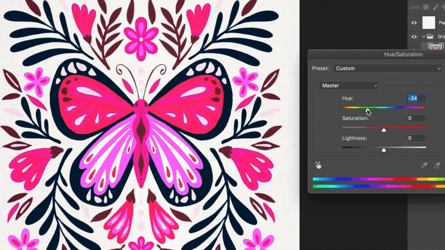
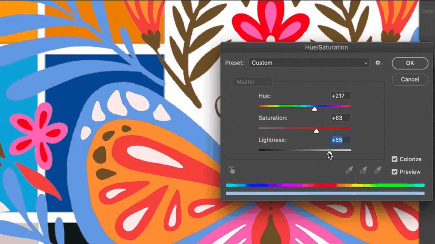
Now let's start exploring! Click your art layer in your layers panel to start. Next, navigate to the Hue & Saturation menu by clicking Image → Adjustments → Hue & Saturation.

Next use the Hue scrubber to get a feel for the different kinds of colors available for your artwork. As I drag the scrubber up and down I take note of what's working and what colors catch my eye.
The next thing that I do during my color exploration process is to invert the colors and see if it produces anything interesting. You can do this by clicking Image → Adjustments → Invert or using the keyboard shortcut cmd + I.
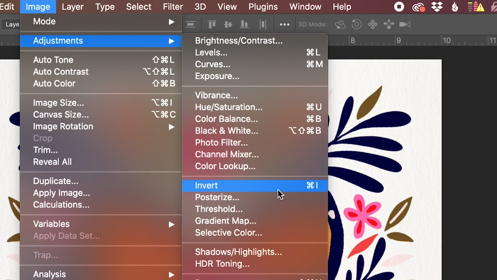
In my example, the result turned out to be something that I didn't really like. And that is totally ok! I invert every single time to see if it produces anything cool, but it doesn't always work out. Sometimes it looks absolutely epic, and other times it's a flop like it was here. But it's such a quick way to explore color so I always give it a shot!

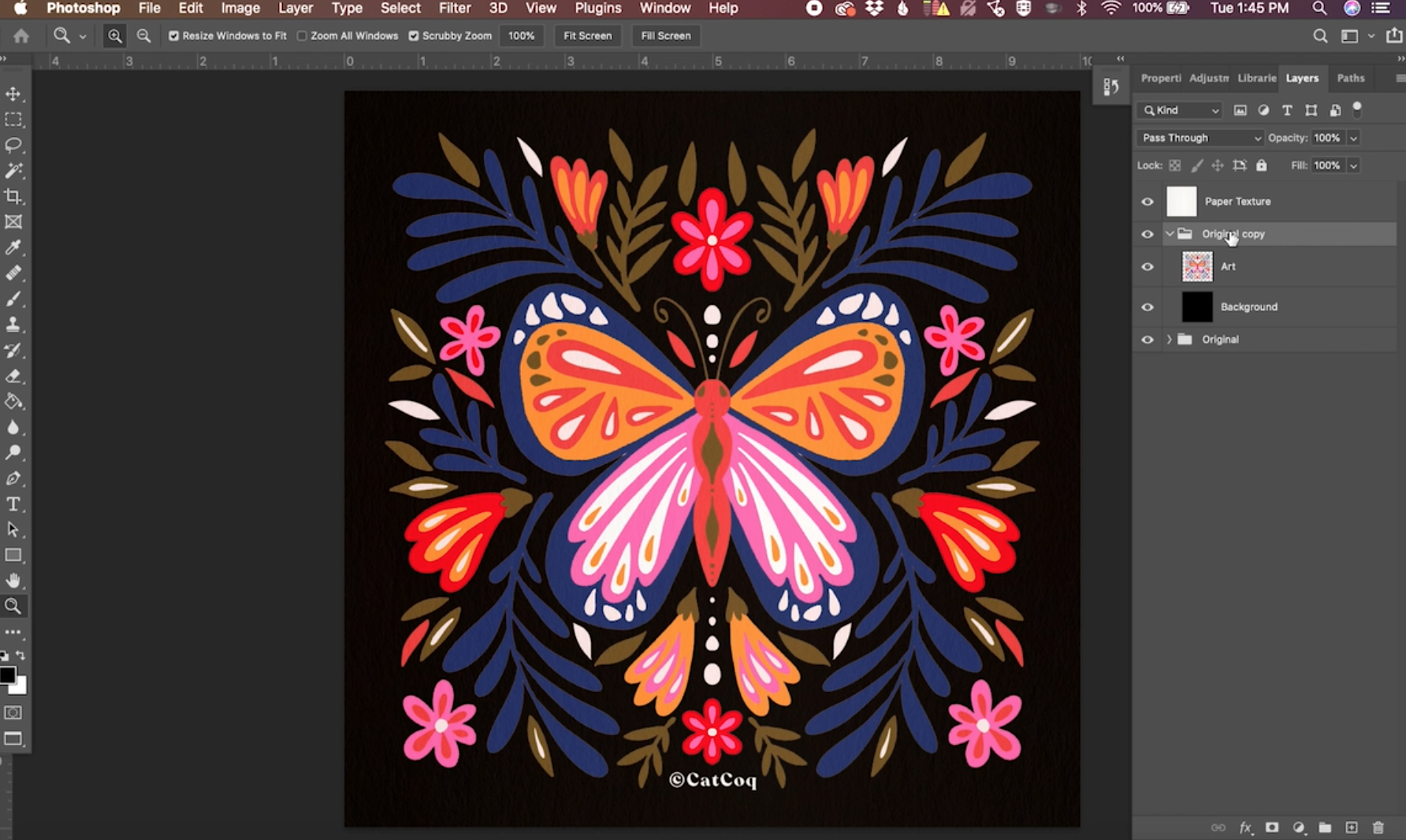
The last thing that I like to do when I'm exploring color like this is to change the background to the polar opposite - black in this case. You can do this the same way that you changed it earlier. Grab the paint bucket tool and turn the background layer black instead of white.

In this example, I really liked how the black looked so I used this as a jumping-off point for one of my colorways. I made a few slight adjustments and created a completely new piece of artwork with just a few clicks. You can easily isolate certain parts of your illustration and adjust the colors individually. We'll go over exactly how to do that in the next section.
Isolated Color Changes Using the Magic Wand Tool
If there is just one area of your illustration where you want to update the color, you can easily do this using the magic wand tool.
In my example, this navy blue is really dark and blends in too much with the black background, but the other colors look really striking against the black. We can isolate the blue and adjust it without having to adjust any of the other colors of the illustration.

To do this, select the magic wand tool by clicking the icon or using the keyboard shortcut "w."

Now, take a look at the setting bar at the top of your screen. The two settings to pay attention to are "Tolerance" and "Contiguous." Tolerance will tell the wand tool how specific to be with its selection. Typically, I keep this around 30, but it will be dependent on your illustration. You can play around and find out what works best. Next, make sure Contiguous is unchecked. This will ensure that the wand selects every element of the same color even if they're not connected in your illustration.

Now, simply click on the area where you want to adjust the color.

Next, pull up the Hue & Saturation menu again to start making your adjustments. You can do this by clicking Image → Adjust → Hue & Saturation.
Now you can play with moving the different scrubbers slightly to find a color that works for your illustration. In my example, I made some slight tweaks that helped that blue color really pop off of the black background. Changing colors is not an exact science. I would encourage you to get comfortable with playing around with the Hue & Saturation screen to learn what works best for your artwork and your style

Color Changes Using a Color Palette & the Eyedropper Tool
If you have an existing color palette that you want to use as a reference for your color updates, you can easily do that in Photoshop. Start by dragging the color palette you want to use into Photoshop, and placing it on your artboard. Make sure it's on its own layer so that it's easy to move and manipulate without affecting your background or illustration. You can move it off to the corner of your illustration using the move tool (keyboard shortcut v). It looks a little messy, but I promise it's worth it! This will help you to easily reference the colors of the palette using the eyedropper tool.
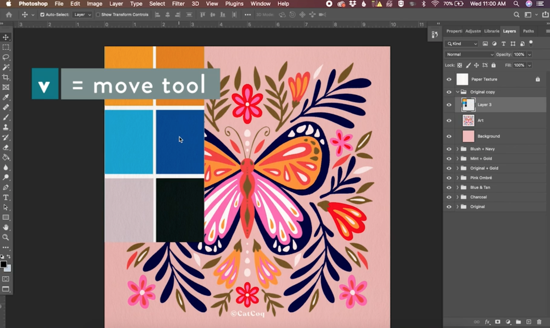
Then you can drag it under your art layer so it's even more out of the way. To do this, simply drag the color palette layer underneath the art layer in your layers panel.

Now it's time to start sampling those colors. Grab the eyedropper tool by using the keyboard shortcut "I."

Then sample the area of the color palette that you want to use by clicking the color.

Next, select your art layer in your layers panel. Then, select the area where you want to update the color with your magic wand tool like we did in the example above. Then pull up the Hue & Saturation menu.
In order to key into the color that you picked with the eyedropper tool, you'll need to check the box next to "Colorize" on the right side of the menu. This moves the hue scrubber to the exact hue of your selection.

Now you can use the Saturation and Lightness scrubbers to get your selection to match the color from your color palette.
Repeat this process with all of the areas that you want to change, and in the end, your illustration should look something like this.

Change the Color of an Entire Piece of Artwork Using Hue & Saturation
When I'm editing the color on an entire piece of artwork my preference is to use the Hue & Saturation tool to take the colors to a complete 180. This means that the colors will change to the color opposite them on the color wheel.

To do this, navigate to the Hue & Saturation menu by clicking Image → Adjustments → Hue & Saturation. Then pull the hue scrubber all the way to the left or the right. Either one of these will produce the same color results so it doesn't matter which way you scrub it.

Changing to the opposite colors on the color wheel changes the color of the whole illustration but keeps the integrity of the color relationships from the original. You will likely still need to make some adjustments to the colors here. In my example, I don't love how the outline color of the butterfly turned out. It was a bit too brown for my liking. You can use the spot editing techniques we used earlier if you have a specific color in mind that you want to change these to, but if not there's another technique you can use to edit these areas.

We are going to use the Color Balance menu to make some adjustments to the color that didn't turn out as well. Go to Image → Adjustments → Color Balance to pull this up.

The magic of using Color Balance to edit is that you can isolate the Highlights, Midtones, and Shadows of your illustration. This allows you to explore different color variations just on these specific areas. If you click Shadows it will adjust only the darkest tones of your illustration. Highlights adjusts the lightest areas, and Midtones adjusts the colors in the middle.

In my example, I want to change the brown-ish outline of the butterfly to something more cohesive with the rest of the palette. It is the darkest part of the illustration, so I will select "Shadows" to adjust it. Now you can use the scrubber to adjust that color and find the perfect fit for your illustration.

Play around with the color balance adjustments until you find the colors that feel best for your illustration. It can take some practice, but if you come into this process with curiosity and an open mind, you'll be able to make some serious color magic from your illustrations.
This tutorial only just scratched the surface when it comes to playing with color in Photoshop. If you want to see a deeper dive into the exact process I use when creating different colorways I'd love for you to join me in my class, Cultivating Color: Vary Color Palettes and Grow Your Portfolio.
In this class, I dive into the details about how to know when to adjust colors and some extra tricks that we didn't have time to cover in this tutorial.
I hope this tutorial was helpful! If you have any questions about color adjustments drop them in the comments below or join me in Cultivating Color to get even more hands-on experience with color adjustments in Photoshop.
