How to Create Repeat Pattern Collections
In this tutorial, we’ll go over surface pattern design collections! Many surface designers (including me!) specifically design with collections in mind. This way, we can license an entire set together rather than just a single design. And one of the most sought-after types of illustration in the licensing world are seamless or repeat patterns.
Repeat patterns are the most versatile type of design out there. By creating seamless patterns you can scale up your designs infinitely so they can fit on a wide range of products from phone cases, to throw pillows, to wallpaper.
Today I’m sharing my tips for creating repeating pattern collections that buyers will love. If you’re selling your designs on sites like Society6 and Redbubble, it’s totally ok to have one-off seamless patterns in your portfolio. But if you want to break into surface design on a larger scale and work with bigger companies that will license your patterns, you need to put together collections. Buyers don’t just purchase one pattern and call it a day. They want to see a cohesive line of various patterns that can be packaged together to sell on products like fabric packs, matching dishware, bedding, home decor, etc. So without further ado, Let’s dive into the basics of creating repeat pattern collections!
What is a collection?
Let’s start with the basics. You may be wondering what a collection even is! A collection is a group of designs that are coordinated in their color, theme, or style.
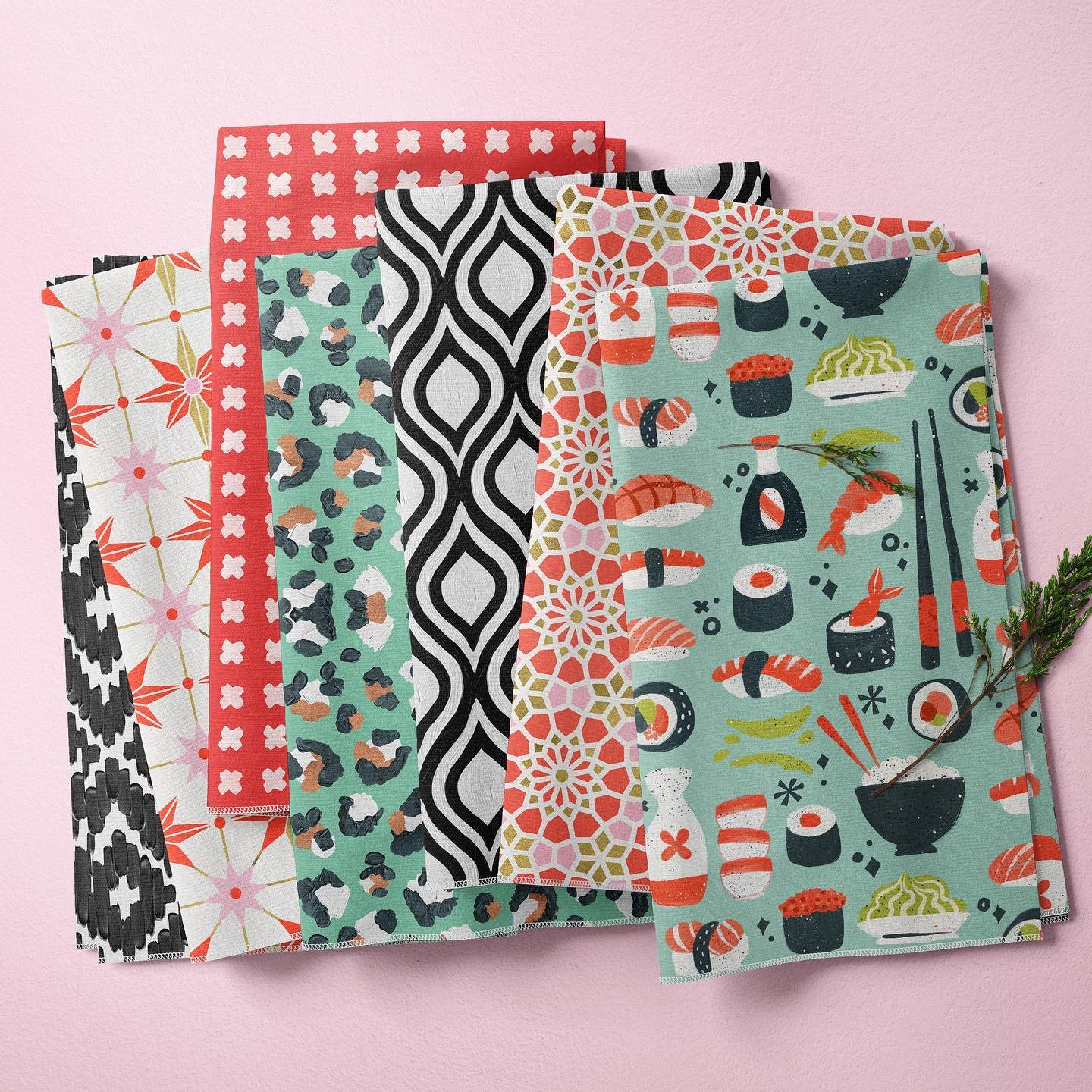
Here’s an example of a collection I arranged:
This collection includes six totally separate designs, but they have commonalities that hold them together as a set.
The pop-toned limited color palette
The modern motifs
The consistent medium
And though they’re cohesive, I didn’t want this collection to be too “matchy-matchy.” Here are some of the elements that make these pieces unique.
There’s a mixture of sizing: some patterns have large elements & some are teeny tiny
Some patterns are icon-based and others are linework-based
Each design holds together on its own
When you’re thinking about curating a collection ask yourself, “Would all of these designs work together in the same room?” Consider the example of a duvet cover, sheets, wallpaper, and throw pillows. You don’t want the exact same design on all of these items, but you want them to all work together in a cohesive manner. Here’s an example of this in my recent bedding collection with Target. The duvet and pillow shams are separate but cohesive designs. The wallpaper is tied in with the collection because it is also geometric and hand-painted like the designs on the bedding. Together they make a full, harmonious collection!
Coming up with collection ideas
If you are creating a collection of designs from scratch, it can be helpful to have an idea of where to start. Collections generally center around a similar theme, color palette, or style. To make sure that your collection is cohesive it can be helpful to include coordinating elements from all three of those categories into the individual pieces in your collection. Let’s break each one down a little further.
Theme
The most popular way to put together a collection is to center it around a certain theme. Themes can be based on motifs, seasons, holidays, hobbies, and much more. The options are endless! For example, here’s a little collection I put together based on my favorite holiday - Halloween!
When I’m looking for inspiration for new collections thing I start with is thinking through what’s currently trending. Learning how to track and forecast trends is an essential skill to have as a surface designer. If you want an in-depth look at how to track trends, check out my blog post, Trend Forecasting for Visual Creatives. Then pick a trend and start to build your collection around it!
The next place to look for themes is to draw inspiration from your own life. As a digital nomad, I spend most of the year traveling the globe and picking up inspiration along the way. This collection was inspired by patterns that I saw in different countries throughout the year.
For repeating patterns specifically, I love to use Spoonflower as a source of inspiration. Spoonflower is a print-on-demand site that sells fabric and other products that require a repeat pattern. They have a team that curates themed collections from the designs available on their site, so it is a great place to check to see what’s out there in the world of seamless patterns! Spend some time browsing their curated themes page and one of their themes will surely spark some inspiration! Plus, they are on top of trends, so this can be a good place to start if you’re new to the world of trend tracking!
Color
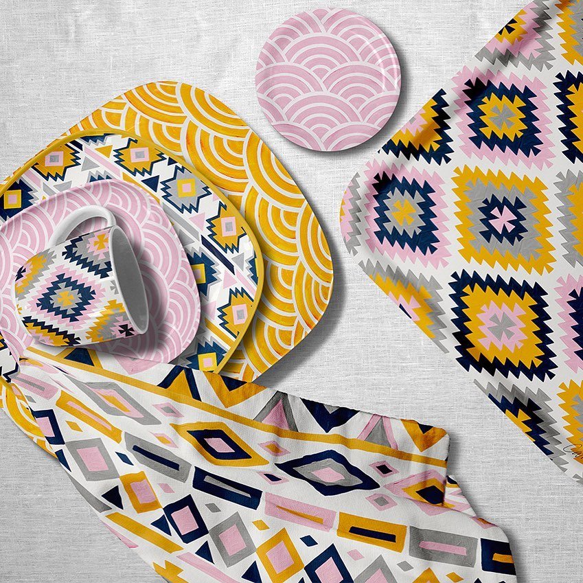
My general rule of thumb is to stick within the same color palette when I’m creating a collection like this pink and gold example
However, sometimes rules are made to be broken 😉 and there are times that it can be helpful to not be too precise with matching colors in your collections. Whether or not you stick to the same palette comes down to personal preference, and it can vary from collection to collection.
Sticking to the same color palette throughout the collection can make it super clear that it’s all meant to go together. But if you want to keep some variation in the colors from piece to piece, consider having one or two colors that you incorporate throughout the collection, even if they’re not included in every piece individually. This can really help tie it together without the different pieces feeling too similar. At the end of the day, this comes down to your vision. It’s your collection and your art style, so whatever color choices you make, make them true to you!
Style
Keep your collections cohesive by sticking to the same style. I generally paint either by hand or digitally. I make sure to stick to the same medium when creating a collection.
Creating variation in your collection
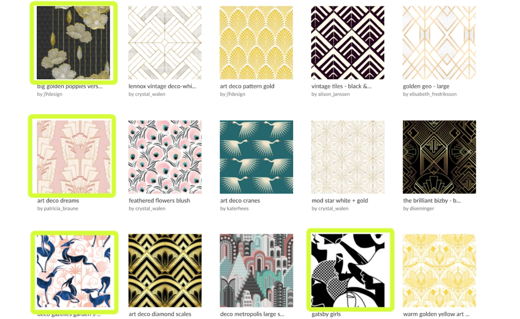
Once you’ve chosen the subject matter of your collection, it’s time to actually create or curate the artwork! Here is an example from Spoonflower’s Curated Themes. This collection is based on an Art Deco theme and includes various elements that make it a cohesive collection without each piece looking too similar. There are three key things to include in a collection to make sure it’s cohesive without being repetitive.
1) Include a similar, complementary color story. Note that in this example, the different patterns use different color palettes, but all together they complement each other. There are elements of the overarching color palette in different pieces that tie it all together.
2) Create variations on the theme. The theme here is Art Deco, and this collection includes a mix of patterns, recognizable icons, and abstractions all under that umbrella.
Patterns
Recognizable Icons
Abstractions
3) Play with sizing. A great collection will include variations in the size of the different patterns. This helps mix things up, and from a licensing perspective, it gives you more options for including your patterns on differently sized products.
Large Elements
Smaller Detail Elements
It can take some trial and error to learn to curate collections, but it’s a skill set that can be learned with practice! And the best part is, you can start with your existing portfolio. No need to go out and create a whole new batch of artwork! Start with what you have and practice bundling your pieces together into collections. This will help you start to look at things differently so you can start designing with collections in mind.
Want to dive deeper into all things surface design?
Join me in one of my classes where I share tons of industry knowledge about surface design and tips for how you can get started with your surface design career right now.
Hand-painted Seamless Patterns in Photoshop
Start with the foundations! If you’re new to seamless patterns, this class is for you. It’s a deep dive into my entire process for creating seamless patterns from painting, to digitizing, to licensing!
Cultivating Color
A great way to create collections from existing artwork is to change up the color palette. In this class, you’ll learn how to transform your existing work into multiple new colorways with just a few clicks.
A Step-by-Step Guide to Art Licensing
Want to learn how to make money selling your artwork? This class will take you through the process of licensing your artwork step-by-step!


