Procreate Tutorial - Adjusting Color in Procreate
One of my top strategies for selling artwork online is to create pieces in multiple different color palettes. Potential customers have varying styles and preferences. If you create a piece in just one color, you're limiting yourself to one type of audience. If you create a piece in multiple different color palettes, you are able to reach a much wider audience and make more sales as a result.
Creating a new color palette for an illustration doesn't have to be time-consuming. It's actually really simple! In this Procreate tutorial, I'm going to walk you through my top tips for adjusting the color of your illustrations in Procreate for maximum selling potential.
All you'll need for this tutorial is a completed illustration in Procreate and a color palette that you want to play with.
Ready to explore new ways of using color in Procreate? Let's dive in!
Create a Duplicate of your Illustration
The first step to creating a new color palette is to duplicate your illustration. After all, you put a lot of hard work into that original illustration! Duplicating it to create a new color palette allows you to keep your original copy intact. It's a way of saving your original work which means you can edit the duplicate to your heart's content without worrying about losing any of your work.
To duplicate your illustration, navigate to the Gallery, tap Select, choose your illustration, and then tap Duplicate. Now you should have two canvases with the same artwork. One is the original, and the new one is where we'll play with changing up the color palette.
Select the duplicate illustration, and we'll get started playing with color!
Adjusting Color Manually
The first technique for adjusting the color of your illustration is to do it manually by dropping the new colors into different parts of your illustration. This is great if you want a lot of control over the exact color adjustments you are making.
When I'm adjusting color manually, I like to start by deciding on a color palette to work with. In my example, I played around with different color explorations for the motif that I'm editing and chose one to use for my manual adjustments.
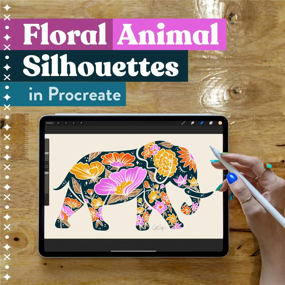
If you want to dive deeper into color exploration and learn how to create color palettes, I go into this step in more detail in my class, Floral Animal Silhouettes in Procreate.
Now that you've decided on a color palette, it's time to start making the adjustments. Start by selecting the layer with your main motif. In my example, it's the leopard in the center of the illustration.
Next, go into your color palettes panel, choose the color palette you want to work with, and select Set Default. This makes it easier for you to reference that palette when you're working on your adjustments.
Next, choose the color that you would like to use from your color palette. In my example, I'm going to change the color of the body of the leopard to a more peachy color. Now, simply drag and drop that color into the area where you want the color to change.
Don't lift your Apple Pencil from the screen when you drag in your color. This allows you to scrub left and right to change the intensity and amount of coverage of the color. You'll see "Color Threshold" appear at the top of your screen, and you can move your pen left and right to change the intensity and amount of the color you just added.
Here's an example of what the color threshold looks like.
Now you can continue to drop new colors into your illustration until it is complete! This is a bit of a manual process, but if you want to have a lot of control over the colors that you're adjusting this is a great way to do it!
Adjusting Color by Layer
The next technique I use to adjust the color of my illustrations is adjusting them by layer. This is great for creating vibrant and colorful motifs. The process is less controlled than manual color adjusting but it allows you to discover some truly unique color variations that you might not have considered otherwise. It's also a much faster and easier technique than adjusting manually!
To start, duplicate your original illustration so you have the freedom to explore color without losing any of your work.
Select the layer that you want to recolor. Then click on the Adjustments menu, select Hue, Saturation, and Brightness, and choose Layer.
Making adjustments using the Hue scrubber is the simplest and fastest way to change the color of your illustration. It allows you to explore all of the colors of the rainbow just by scrubbing back and forth through the different hues. I love playing with palettes that are less literal in my motifs. This gives my artwork a vibrant look and allows me to appeal to a wide range of potential customers.
You can play with Saturation as well to see how it affects your illustration. In my example, it doesn't change much since it's already a very saturated illustration.
I don't use the Brightness scrubber to change the brightness of my illustrations. I use "Curves" to change this because it gives me a lot more control. To get to the Curves menu, go back to Adjustments and select Curves.
When I use Curves, I like to use the Gamma setting and drag the far right and far left areas of the spectrum inward a bit. From there, I can pull the center of the curve up and down to adjust the brightness. This gives me more control over the areas of brightness being adjusted. It allows the dark areas to stay dark even if I'm making the light areas brighter.
Adjusting with curves is something to play around with on your own and discover what works for you. It can be really helpful to give you more control over the brightness of your illustration without washing it out or making it completely dark. As with all color exploration, just play with it and find what works for you!
The last color adjusting tool I want to show you is called "Gradient Map". You can find this in the Adjustments menu.
This tool allows you to choose from a variety of different gradients and see how they affect the color of your piece.
Once you select a gradient you can make changes to the colors using the tools I showed you previously. My favorite way to adjust the colors from a gradient is by using curves.
Adjusting color by layers is a really fun and intuitive way to explore color. In my example, I never expected that I would end up with a turquoise leopard and hot pink accents, but I love the way it turned out. Don't be afraid to explore when you're adjusting the color of your illustrations. This will help you to discover new possibilities and create unexpected and beautiful adjustments to your original artwork.
I hope that this color exploration tutorial was helpful! If you have any questions, drop them in the comments!
Looking for a deeper dive into Procreate? I teach in-depth procreate tutorials in my Skillshare classes. You'll learn new things to draw in Procreate and will get all my best Procreate tips and tricks. Ready to take your Procreate drawings to the next level? Join me in one of my full Procreate classes! You can enroll in any of these classes for free when you sign up for a free trial with Skillshare.
Procreate for Beginners
This is a comprehensive, all-in-one Procreate course. You’ll create five cool illustrations, each lesson focusing on a core skill in Procreate.
Floral Animal Silhouettes
Wondering what to draw in Procreate? In this class, you'll learn to draw your favorite animal with floral embellishments on your iPad.
Drawing Seamless Patterns in Procreate
In this class, you will learn how to use your artwork to illustrate professional, repeat patterns that easily line up into perfect pattern blocks.
Draw Your Dream Home in Procreate
This step-by-step class covers the full process of envisioning your dream home and drawing it in Procreate.


